Online marketplace design: the 5 principles of a great marketplace UX
Five key online marketplace design principles and tons of practical tips and examples. Courtesy of marketplace UX designer Fiona Burns.

Last update

Great online marketplace design can bring a big boost to your conversion rate. In this guest post, marketplace UX designer Fiona Burns explains how.
Your online marketplace should be intuitive, enjoyable, and easy to navigate. Marketplaces don’t just need to work for customers. They need to work for providers as well. But designing for both can be quite tricky.
In this article, I share five basic principles I use to design great experiences for my marketplace clients. In a nutshell, a great marketplace user experience achieves five things:
- Trust. Design can help your users feel more comfortable about each other and your marketplace.
- Matching. How customers find the most relevant providers is a critical marketplace UX challenge.
- Value. A great marketplace website provides value to users before they’re asked to give information about themselves.
- Stickiness. Does your marketplace UX keep visitors returning to your marketplace?
- Accessibility. Making sure all kinds of people enjoy using your marketplace is vital.
In the following paragraphs, I discuss each principle in more detail. I also offer some practical tactics and show examples from marketplaces that are doing it right. Let’s get started with the first principle: developing trust through design.
Earning visitor trust and confidence is key to the success of your marketplace, particularly at an early stage. The more credible you are, the more likely someone is going to make a purchase, or sign up to become a provider.
Without trust in the marketplace, some of the most successful platforms would have never got off the ground. For example, Airbnb invites people you don’t know to sleep in your private home. Uber persuades us that it’s safe to jump in a stranger's car. Something your parents probably told you to never do when you were a child.
Earning trust when you’re an unknown early-stage marketplace that people aren’t yet familiar with is hard. The good news is, there are several design techniques you can employ to build trust and credibility in your online marketplace.
When we discover a new product or service, we often like to know if someone else has used it and whether or not they had a good experience. This is because, when we’re unsure about something, we’ll look to others for guidance. In psychology, we call this social proof.
If you have any customers (or even early-beta testers), ask them to provide a review of their experience using your marketplace. Display those reviews on your homepage. Three or four reviews is enough.
The best reviews include:
- A short quote: 2–4 sentences
- A clear profile image of the reviewer. If someone is willing to put their face to their review, this increases credibility that the review is real. Never use stock images.
- The name of the reviewer. If you’re worried about privacy/security, then you only need to display their first name and the first letter of their surname.
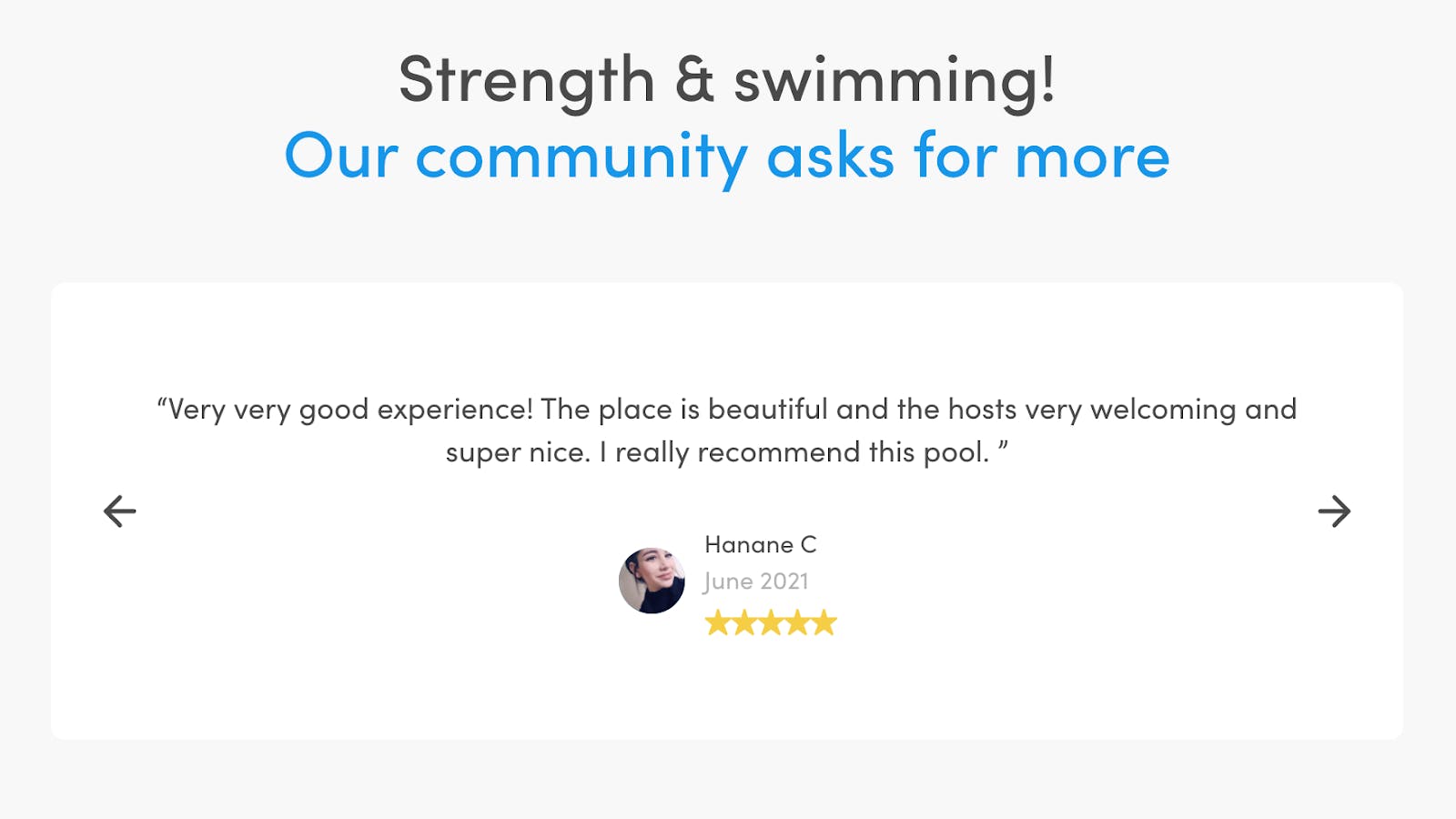
I really like the way Swimmy has displayed customer reviews on their homepage. The design is clean, clear, and credible.
If you subscribe to any independent review providers such as Trustpilot, Feefo, or Google Reviews, you can also include their badge and your rating on your homepage to increase trust.
If you’ve been featured in the press or have customers that are well known or recognizable, put their logos on your homepage! This is another form of social proof. It tells the visitor that your marketplace is trusted by other, more established brands.
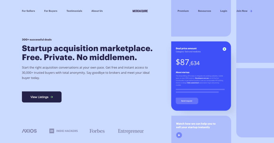
This example shows how MicroAcquire has used logos in the hero section of their homepage to demonstrate that they’ve been featured in popular publications such as Forbes and Indie Hackers.
If a visitor to your website has never heard of your online marketplace before, it is likely that they’ll be curious to know who is behind the brand. In order to build trust, they’ll be looking for a connection with the founders and a message that resonates.
I recommend that you use the About page to tell them who you are, why you are building this marketplace, and why you care about this particular market or industry. This is your chance to show that you understand your users’ pain points and are passionate about providing a solution.
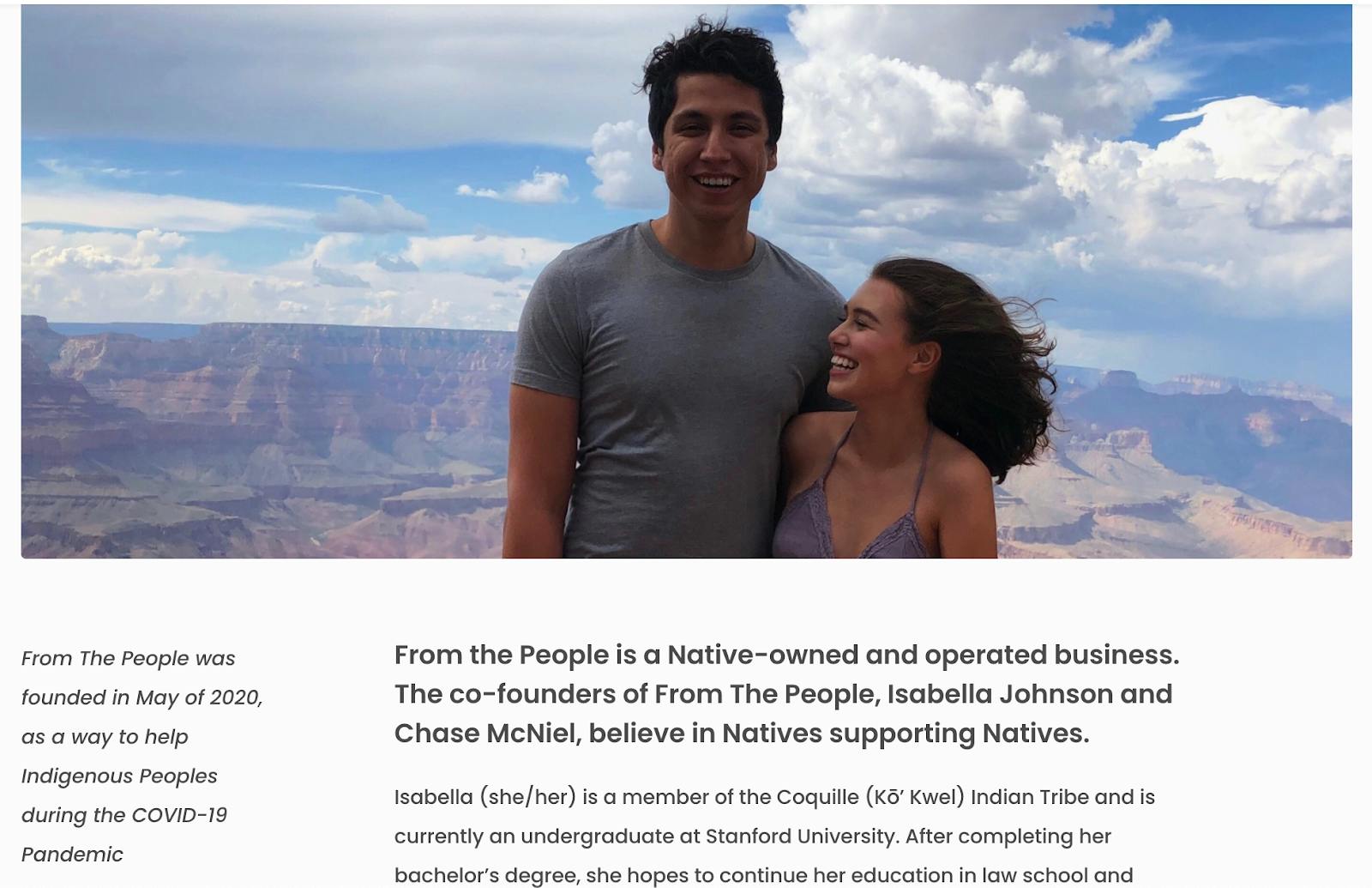
From The People does this really well. You get a real sense of the founders’ personalities and feel their passion to bring about change to their industry.
A blog can be an excellent tool to demonstrate that you’re a subject matter expert. This, in turn, will help you to gain trust and credibility in your chosen marketplace community. You can share tips, advice, “how-to” articles, video explainers, and interviews with industry leaders. Building trust through your blog can help you to convert customers and providers on your marketplace.
A blog is also great for SEO and will help you to drive more organic traffic to your site.
Taskrabbit, a marketplace to find people to help with small tasks and home services, has an excellent blog covering DIY guides and home inspiration. People go to Taskrabbit’s blog for knowledge and advice and it’s a great way to convert people to customers or providers.
If your marketplace enables customers to view provider profiles, it’s important that your providers also demonstrate credibility in their work. Here are a few online marketplace design techniques you can use to do this.
The first is provider reviews and ratings. This involves building a mechanism whereby customers can review the provider once the booking is complete. You can then publish these ratings and reviews on the provider’s listing page. This will help other customers to decide if this provider is right for them.
A rating and review system can be complex to design and build. However, marketplace software like Sharetribe already have this functionality built in as standard.
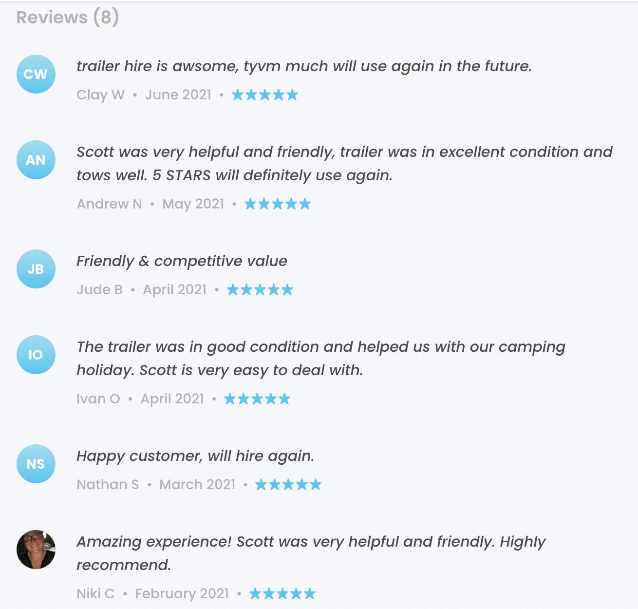
This is an example of how reviews are displayed on a provider’s listing on Sharetribe marketplace, Local Trailer Hire.
Related to this, you could also display the provider’s average rating and the number of bookings on their profile page and the search results page. This gives customers an idea of how popular the provider is. They also get a benchmark for comparing to other providers.
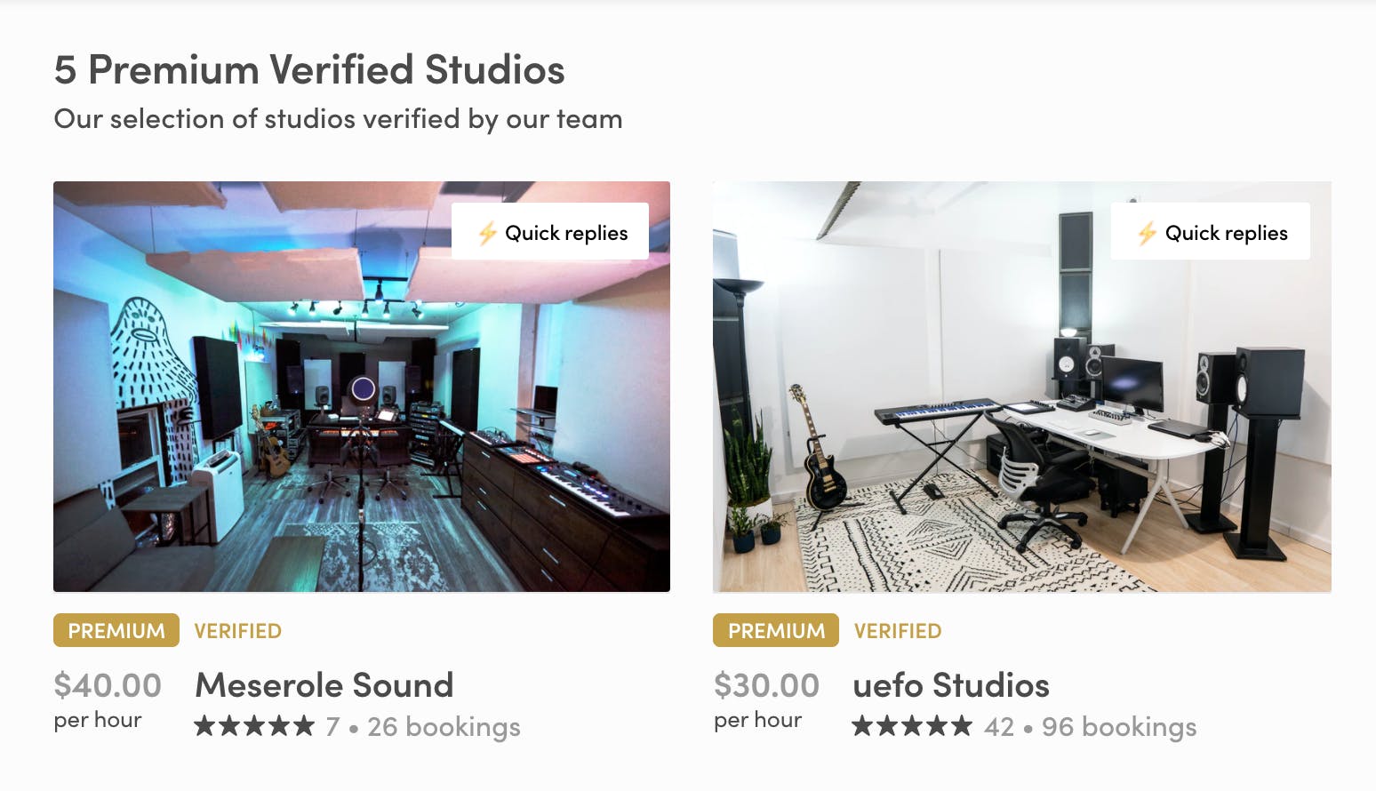
Studiotime listings showed the average review score, the number of reviews, and the number of bookings.
Make sure providers are able to demonstrate their previous work. For example, if you had a marketplace for landscape gardeners, a customer would want to see what skills and techniques the gardener is capable of (e.g. laying turf, erecting fences). They're probably also curious about their individual style and flare. You can answer these questions by including image galleries or case studies on provider profiles.
In some industries, professional accreditations, memberships, certifications, and qualifications are important. If this is the case in your niche, make sure your providers are able to upload proof of these.
Finally, if providers go through any kind of “verification” or “approval” process, let customers know! Add a verification star or approval badge to these listings to show that you have vetted this provider.
The matching mechanism of your online marketplace is one of the most important features. For the best user experience, you should try to match customers with the most relevant provider(s) as quickly as possible.
Here are a few online marketplace design techniques you can use to improve the matching experience.
In order to match your customers with relevant providers, you’ll need to ask your customers a few questions to find out what they are looking for. For example, Uber asks where you are and where you’re going, and Airbnb asks for your holiday dates and destination.
Whilst it’s important to gather information from your customers, asking too many questions can result in a poor user experience. Put yourself in the customer's shoes for a moment. No one likes filling in forms. People often find them boring and time-consuming. Plus, no one wants to invest their time in answering questions when they don’t know whether the results will be any good or not.
For a good user experience, I recommend that you limit the number of questions you ask customers to three. Asking the right questions is therefore key. Think about the 1, 2, or 3 most crucial questions you need to ask in order to provide a meaningful list of matching providers.
It’s useful to provide customers with options. However, it doesn’t take much for them to feel overwhelmed by too much choice. Research has shown that when you give people too many options, they find it more difficult to make a decision. On the other hand, if you show too few options, customers might feel that their choice is too restricted.
Therefore, getting that balance right is key.
So, first, ask your customers a few quick questions about what they are looking for. After that, I recommend showing them 3–6 close matches rather than 100 mediocre ones. A shorter list feels more curated and personal and will ultimately help your customer to make a decision quicker. This could have the added benefit of leading to higher conversion rates.
When I founded my own marketplace, I saw a huge boost in conversion rates when we put our best providers at the top of the search results page. I now recommend that all my clients do the same.
But how do you measure or rate your best providers?
For us, it was a combination of factors that we gave weightings to. Some of these factors included:
- Response time to enquiries/bookings
- Conversion rate (successfully taking an enquiry to a booking)
- Average review score
- Number of views
- Number of bookings
- Number of reviews.
It took some time for us to play with the weightings of these factors to produce the best results. Each marketplace is different and the factors and weightings will not be the same for everyone. You’ll need to think carefully about which factors are most important to your customers and do some testing to find the optimal algorithm.
Finally, you could implement a concierge marketplace model. This is where the marketplace provides assistance from a human to help the customer find their perfect match. Most marketplaces charge a premium for this service.
One big advantage of the concierge model is getting closer to your customers and developing a deeper understanding of their thought processes and considerations. As you get to know their needs and wants better, you’ll be able to improve your matching service further.
Most online marketplaces want to capture the email addresses of potential customers and providers as soon as possible so they can market to them. However, if you ask for this information too soon or in the wrong context, it will do more harm than good.
When a new visitor lands on your website, they want to know who you are and what you can do for them. They want to explore your marketplace and find out if your providers are relevant to their needs. If visitors can’t obtain any value without providing their personal details, it’s likely that they’ll leave and not come back.
People are also getting more aware (and wary) about who they give their personal data to and what companies are going to use it for. Your visitors might therefore be wondering whether their email address will be passed on or sold to a third party. These concerns can prevent visitors from handing over their genuine details. This, in turn, can lead to them abandoning your site (and going to a competitor). Or giving you a dummy email address just to get over the data hurdle.
These anxieties can be soothed with good online marketplace design.
First, let the visitor explore your site to see what you’re about. Try to provide them with some value (e.g. showing a list of relevant providers) before you ask them to sign up.
Secondly, make sure the information you ask for is in context and at an appropriate stage of the user journey. For example, asking a visitor to sign up when they want to book a listing. Explain clearly why you need to capture their data at this stage and assure the visitor that you will not sell their data or spam them.
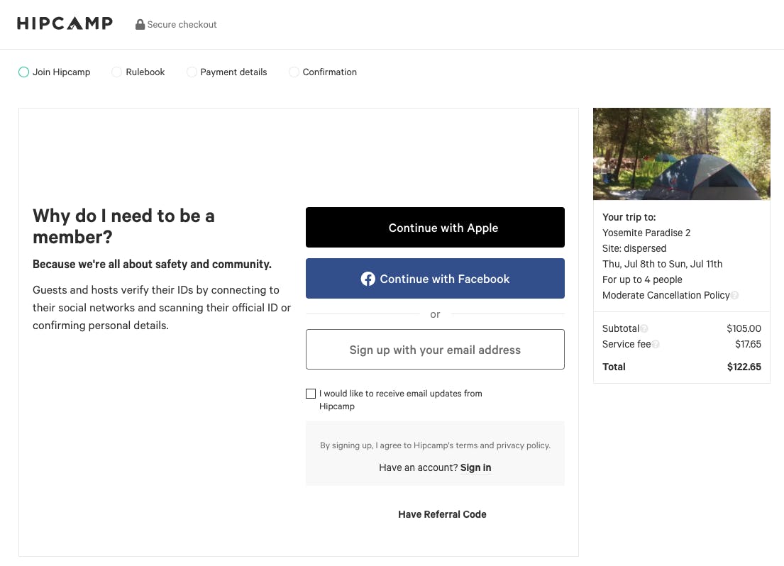
Hipcamp does a great job of explaining why you need to sign up and become a member before you can place a booking.
Finally, only ask visitors for the bare minimum details (e.g. name, email address, and password). For one thing, no one enjoys filling out a long form. And for another, visitors don’t want to share more personal data than is strictly necessary.
Did you know that it’s easier (and cheaper) to convert previous customers than it is to convert a brand new one? That is why customer loyalty is so important. Form a long-term relationship with customers and providers, and they’ll be more likely to buy from you again.
Stickiness, however, goes beyond customer loyalty. Stickiness can refer to how long visitors spend on your platform, how many pages they explore, as well as how frequently they come back. The longer they hang around, the more engaged they are. This shows that what you’re providing is valuable to your visitors.
Here are a few online marketplace design techniques you could use to increase the stickiness of your platform.
One idea is to allow customers to build their own collection of items or services that are available in your marketplace.
Let’s take a look at iStock, a marketplace for stock images. They allow users to create collections of stock images called boards. Users can give their boards names and share them with others. This type of feature can be really useful for bloggers and copywriters who regularly need stock images for their articles. They can create collections for various themes or topics they write about and come back each time they need to buy a new stock image.
Another strategy you could use is personalized feeds. A good example is Youtube.
Based on your watch history and video performance (e.g. average watch duration), each time you visit Youtube, they show you a new, personalized list of videos that they think you would enjoy. This is part of a well-known psychological technique called The Hook Model that keeps visitors coming back. The more often you come back, the more ads Youtube can show you, and the more money it makes.
On the supply side of your platform, a great way to increase stickiness would be to provide tools that enable your providers to build their own brand or reputation. Patreon, a marketplace helping creators to deliver exclusive content to their followers, is a great example.
Patreon provides useful features that empower creators to build their personal brand. These include helping them to set up their own “creator” page, providing marketing opportunities through live events, PR and social, as well as expert coaching from the Patreon team.
Providing supply-side workflow tools that help your providers to run their business through your platform can significantly improve the stickiness of your platform.
This is exactly what Upwork, a marketplace to find freelancers, does. Features that Upwork provides to providers include submitting proposals, sending invoices, and even creating agencies (e.g. teams and sub-contractors). Being able to manage everything in one place gives freelancers reason to keep coming back to Upwork and using it for future freelance jobs.
Web accessibility describes whether a product (e.g. a website) can be used by people of all abilities and disabilities.
When designing websites, we need to consider how our design will impact people who are visually impaired, blind, or hearing impaired. We also want to pay attention to using language that is easy to understand.
Web accessibility affects a large proportion of people. In fact, globally, there are approximately 300 million people with color blindness. That’s almost the same number of people as the entire population of the USA!
By ignoring web accessibility, you are at risk of restricting your audience’s ability to engage with your site. Instead, consider the following recommendations on how you can improve the accessibility of your online marketplace design.
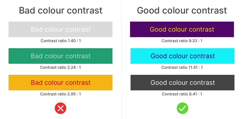
Always ensure there is high contrast between the background and foreground colors of your website. For example, the background color of a button and text written on it.
A really great tool to use is a color contrast checker. You simply enter the hex code of your background and foreground color, and it will tell you if it meets accessibility standards.
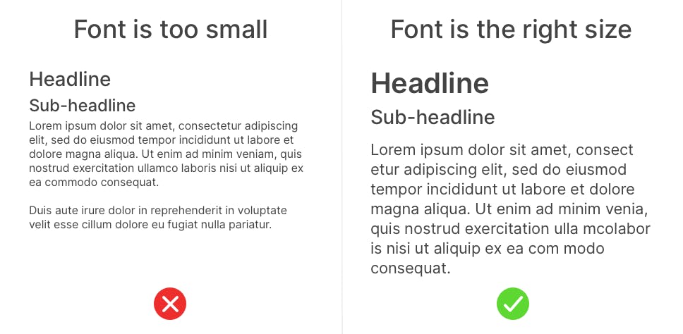
Secondly, the size of your text is really important. People who can’t see very well won’t be able to read writing that is really small. As a result, they may find the experience of navigating your marketplace uncomfortable. All fonts are different, but a general rule of thumb is don’t go smaller than 16 pixels for your body text.
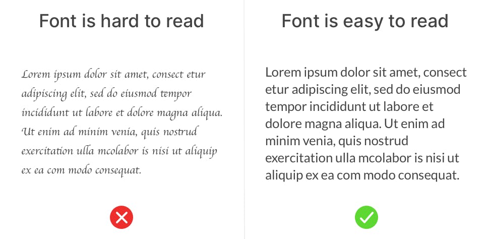
Finally, make sure you pick a font that is easy to read. Swirly, curly, handwritten-style fonts might look pretty but they can be very difficult to read. People tend to skim web pages and don’t want to spend time trying to figure out what your message is. So choose something that is easy on the eye that people can read at a quick glance.
Blind people often use a screen reader to read the pages on your website out loud to them. But what happens when the screen reader reaches an image?
Every image on your website has something called an Alt Text. When a screen reader reaches an image, it reads out the Alt Text.
When you upload an image to your webpage, the Alt Text is usually set to the image’s file name by default. So if you upload an image called IMG_58483838.png and you don’t update your Alt Text, that is what the screen reader will read out to the visitor.
The good news is you can change the Alt Text to be more descriptive and helpful to the visitor. E.g. “Stack of blueberry pancakes”.
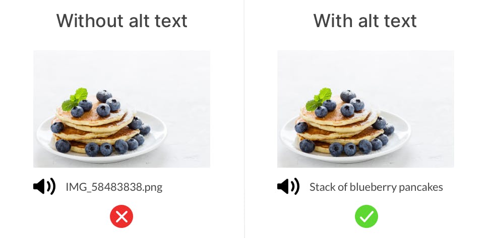
Alt Text is also used by search engines such as Google to better understand what your website is about. When done well, alt texts can improve your ranking, thereby improving your SEO.
As for videos, we can use audio description. This is additional commentary that explains what's happening on screen.
If you’ve got video content on your site, it’s important to consider people who can’t hear very well.
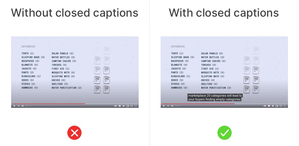
Using closed captions in videos is a great way to improve the experience for the hearing impaired. It’s also helpful for people who want to watch your videos but don’t want to watch them with the sound on. For example, maybe they’re on a bus and don’t have their headphones with them.
When a new visitor lands on your marketplace website, you only have a few seconds to convince them to stay and explore further. Accessible language ensures every visitor will understand your message quickly and effortlessly.
Try to keep the length of sentences and paragraphs fairly short. Write in plain language like you are talking to an 8-year-old child. If your marketplace is in English, tools like Grammarly can help you adjust the readability of your copy.
Think about the complexity of the vocabulary you use and whether or not it’s appropriate to your audience. Try not to use jargon, acronyms, or other words that people might not be so familiar with.
Again, choose a font that is easy to read and consider using a larger text size. Make it an easy and pleasant experience to read the text on your website.
In this article, I looked at five key principles of online marketplace design and shared tactics you can use to create a great experience for your customers and providers.
First of all, trust is at the core of your online marketplace experience. Without it, your marketplace could fail. However, simple design techniques such as displaying customer reviews on your homepage and bringing personality to your About page can help to build visitor trust and confidence.
Secondly, matching customers to the right providers is another key experience that often has plenty of room for improvement. My top tips are to match customers as quickly as possible by not asking your customers too many questions, and to surface your best providers first.
Next, provide value to your visitors before you require them to hand over their email address or other personal data. You’d never ask someone who wants to enter a shop for their email address before they can come in, so don’t do it online.
Get visitors to return to your marketplace regularly by providing rewarding experiences and value. For customers, this could be personalised feeds, and for providers, this could include tools to help them run their business.
Finally, make your online marketplace accessible to people of all abilities and disabilities! Simple tools such as colour contrast checkers or copywriting tools make sure that your text is legible. This can make a huge difference to the number of people who are able to comfortably navigate your website.
Give it a go – I’d love to hear how you get on and what improvements you see to your conversion rates! You can reach out to me on Twitter @marketplaceux.
You might also like...

How to design the booking flow of your service marketplace
How ten well-known marketplaces match supply and demand, and how to pick the right approach for you.

How to design your marketplace transaction flow
The science behind minimal abandoned carts for marketplace platforms.

The marketplace search engine: How to help your customers find what they’re looking for
Your success depends on demand finding its way to supply. Here’s how to make it happen.
Start your 14-day free trial
Create a marketplace today!
- Launch quickly, without coding
- Extend infinitely
- Scale to any size
No credit card required