Modify listing card thumbnails
Learn how to customise the thumbnail for listings that don't have a listing image.
Jul 24, 2025


Note: The implementation in this article is built on top of Sharetribe Web Template v8.6.0, so if you are working on a later version, you may need to make some adjustments.
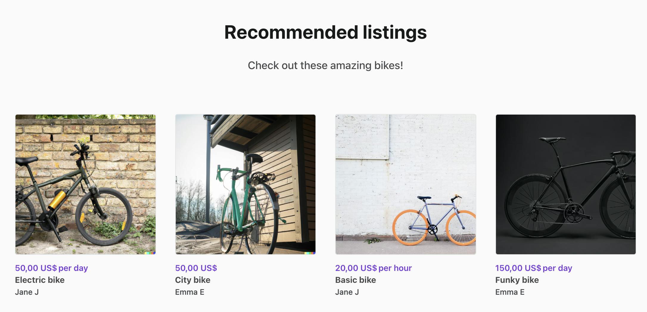
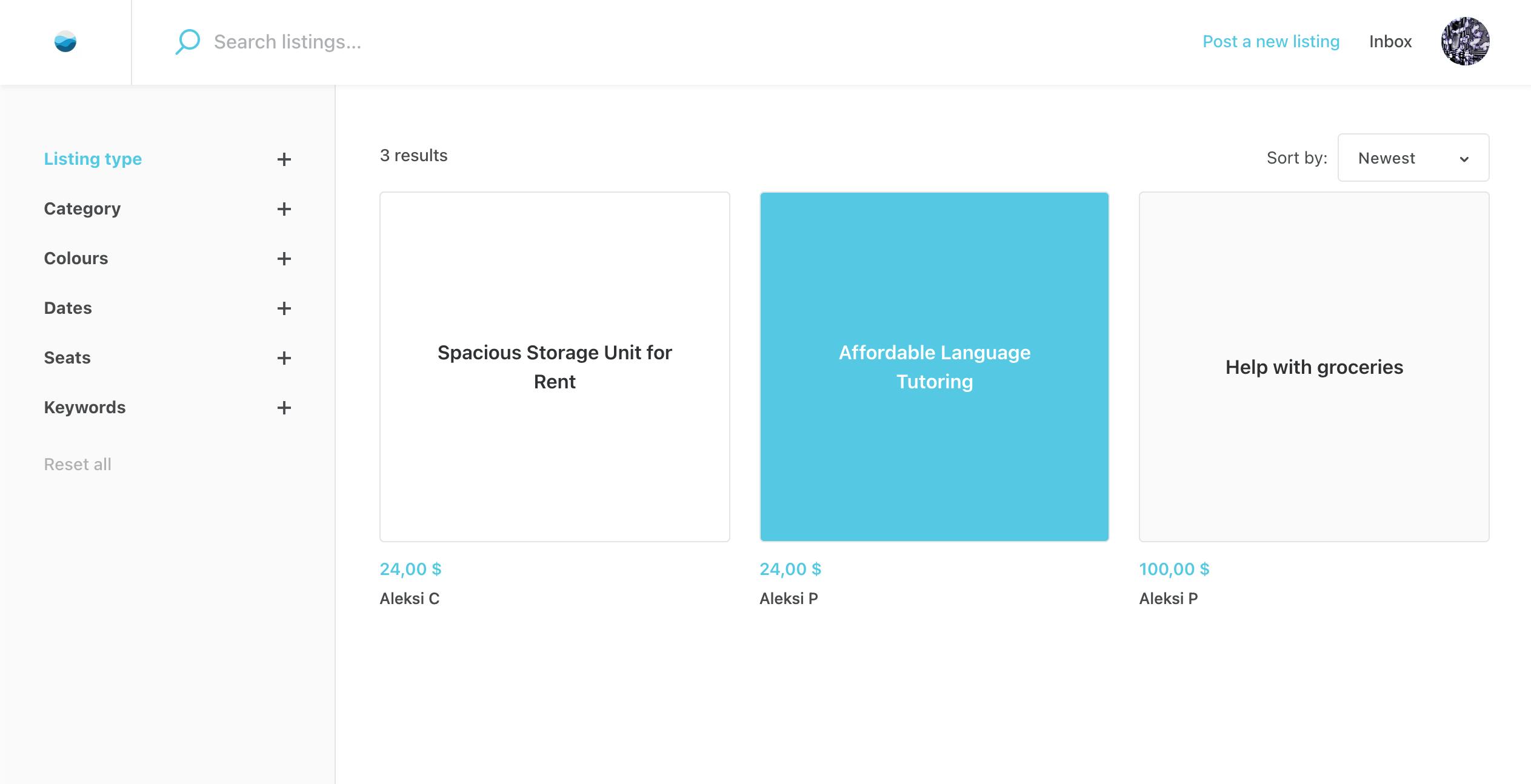
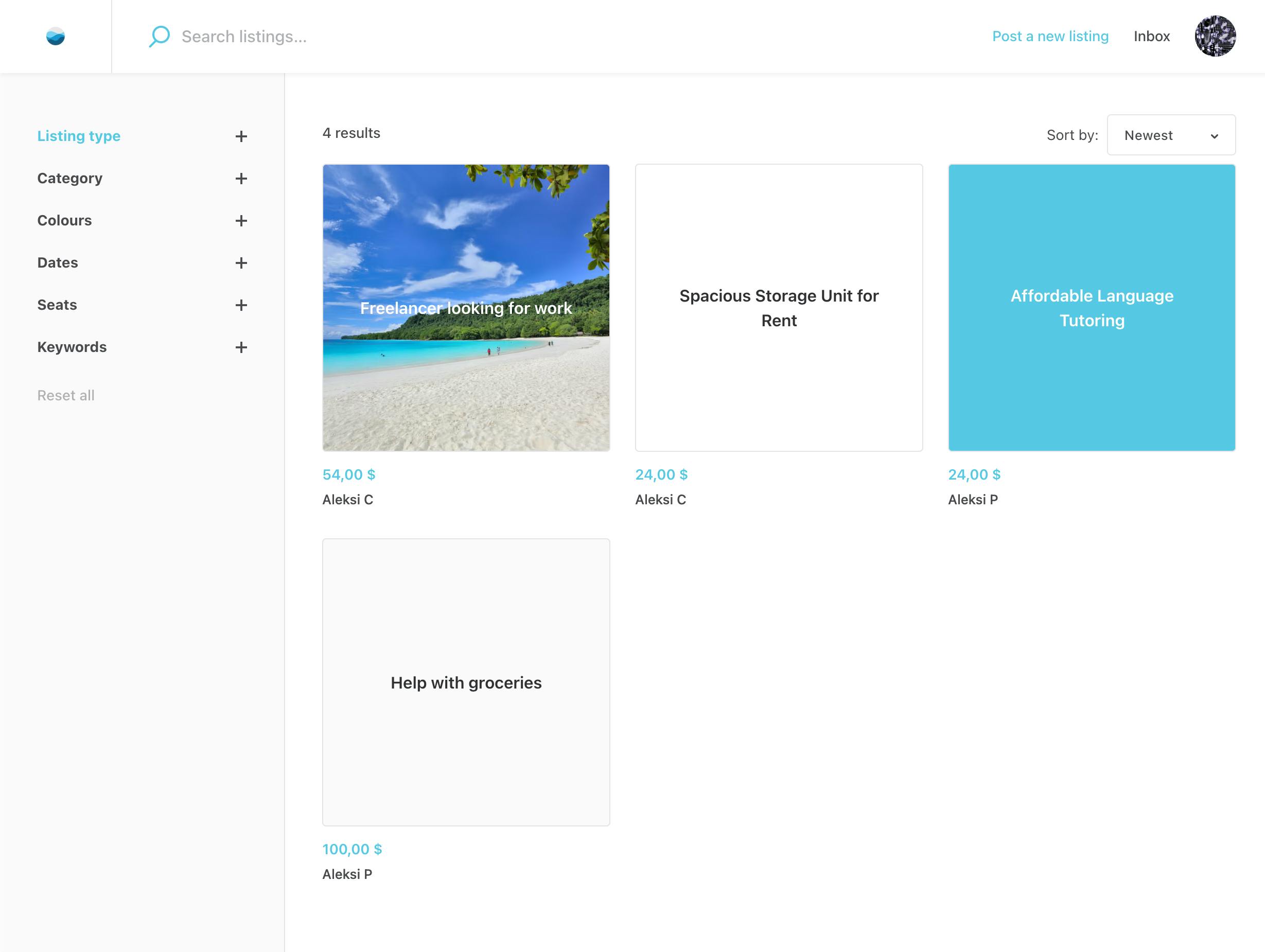
In your Sharetribe marketplace, you can create a listing type that disables the default image field. Listings created using that setting will ask the user to select a background color that is used throughout the marketplace as a background color for a listing “card”, that is shown instead of a listing image. This can be handy in a marketplace where images may not be relevant, e.g. in a marketplace for services or digital products.
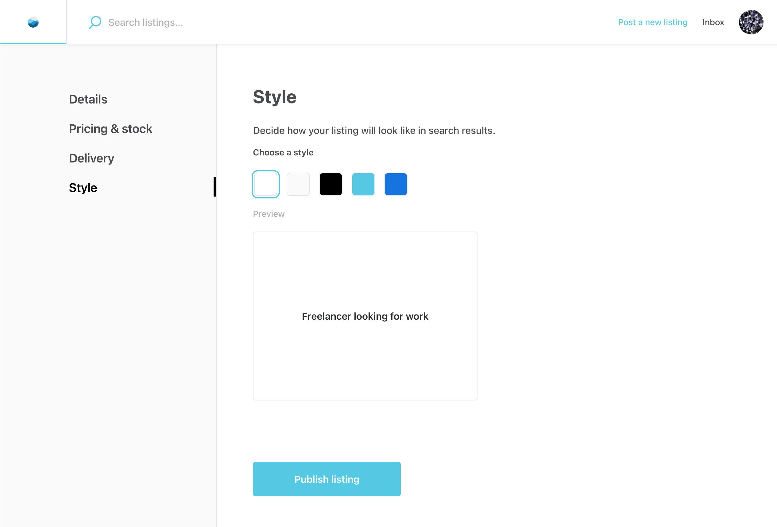
Instead of rendering the image associated with the listing, the template uses a thumbnail component, and renders a stylized listing card on the search page. Users can choose from five default color options when creating a new listing. You can find these options defined in the src/utils/types.js file.
Add a new option
To introduce a new option, you'll need to modify the following files:
- /utils/types.js, create add a new color scheme
- /EditListingStylePanel/EditListingStyleForm.js, map the color scheme to a CSS variable
- /ListingCardThumbnail/ListingCardThumbnail.module.css, define the style rules for the new color scheme
Start by adding your new color scheme value to the colorScheme array in the types.js file:
export const colorSchemes = ['white', 'grey', 'black', 'main-brand', 'primary-button', 'pink'];
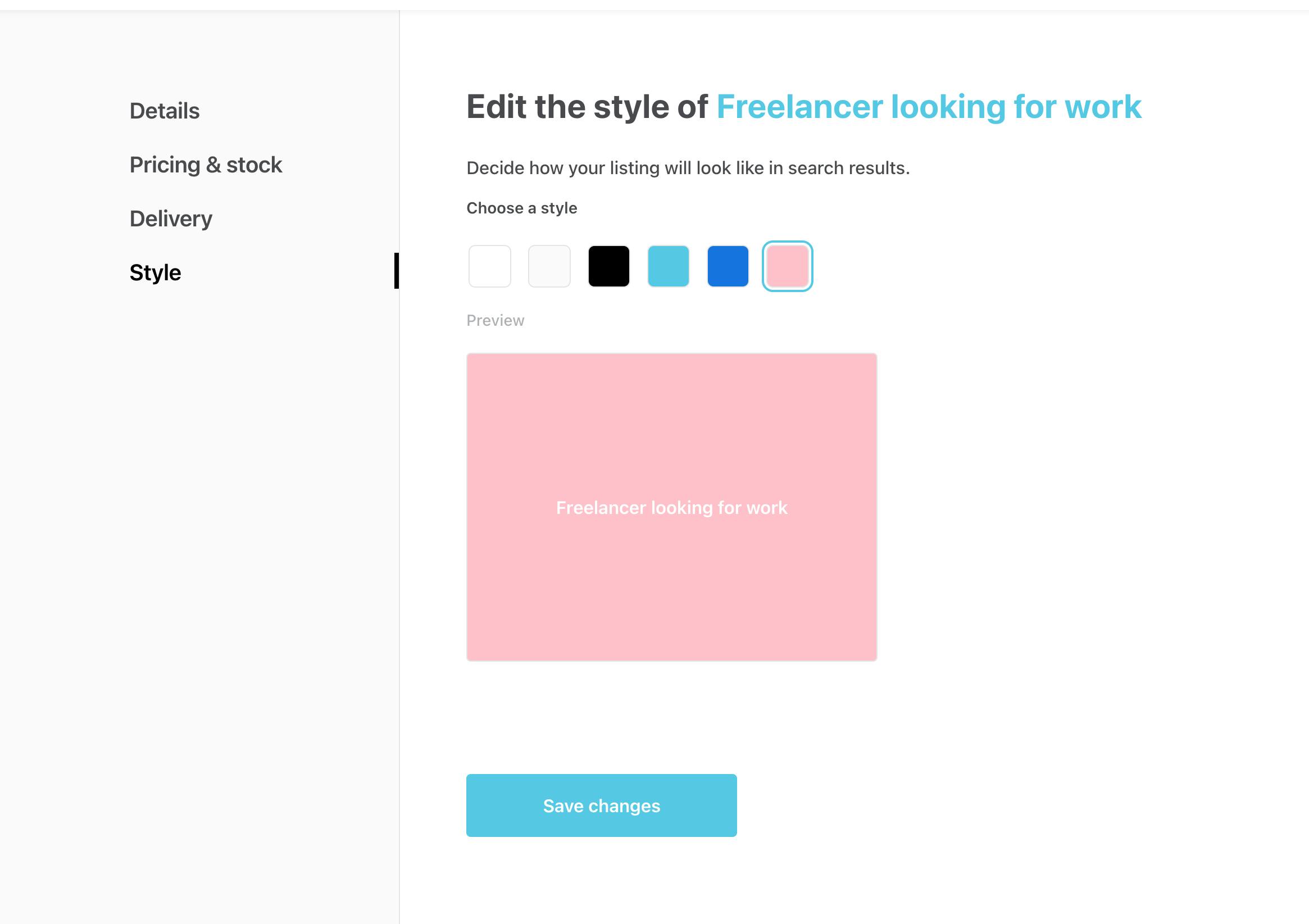
Next, add your new color scheme to the colorSchemeMap object in the FieldCardStyle component. You can use a CSS variable available in the global scope. Use an existing one defined in marketplaceDefaults.css or add a new variable. For this example, we defined a new --colorPink variable in the marketplaceDefaults.css file. This value will define what color is used to fill the radio button option when creating the listing.
const colorSchemeMap = {
  white: '--colorWhite',
  grey: '--colorGrey50',
  black: '--colorBlack',
  'main-brand': '--marketplaceColor',
  'primary-button': '--colorPrimaryButton',
  'pink': '--colorPink',
};
Finally, add a new CSS class for your color scheme following the existing pattern:
.pink {
  color: var(--colorWhite);
  background-color: pink;
}
You should see the changes when you refresh the page:
Keep in mind that the color scheme value defined in types.js must match a corresponding key in the colorSchemeMap object. If these values are out of sync, the system won't be able to apply the correct styling. In ListingCardThumbnail.module.css, the CSS class name also needs to match the color scheme value. This ensures the correct styles are applied when rendering listing cards.
The selected listing style is saved in the listing’s extended data under the key cardStyle. If you have existing listings in your marketplace, avoid removing those keys from your template or changing their values unless you’ve updated the stored data accordingly. Otherwise, existing listings may break or display incorrectly.
Using an image as the default thumbnail
Instead of a solid color, you can set a background image for the listing card. In ListingCardThumbnail.module.css, you could add:
.pink {
  background-image: url('/public/static/your-image-file.png');
  background-size: cover;
  background-position: center;
  color: var(--colorWhite);
}
You could do the same with a .gif too:
.pink {
  background-image: url('/public/static/animation.gif');
  background-size: cover;
  background-position: center;
  color: var(--colorWhite);
}
Find these instructions written also in a machine readable format in the web-template, in a README.md file under the ListingCardThumbnail directory.