How to customise a Section, Block or Field using options
Introduction
The Sharetribe Web Template renders content pages using data from Pages, the Sharetribe headless content management system. This how-to article assumes a basic understanding of the Pages feature and how the template renders content pages using the PageBuilder. We suggest reading the following articles before proceeding:
This guide will introduce you to best practices for styling and customising components used by the PageBuilder.
Customising components
Sharetribe Web Template uses a component called the PageBuilder to render content pages. You will likely want to change the style and structure of content pages, and the PageBuilder is where you should make those changes. It is good to note that changes to the PageBuilder will affect how all content pages are rendered. If you only want to customise a specific section on an individual content page, you need to take a different approach.
Let’s lay out a more concrete example of this scenario: say you want to define that for all Sections on the landing page using the template section-article, the title and ingress should be aligned left, and on all other pages they should adhere to the default styling, i.e. be centred:
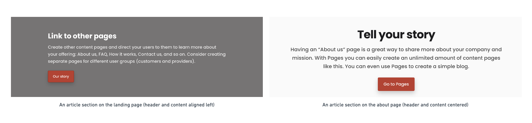
Making these changes directly in the SectionArticle component will result in changes across all content pages. Let’s demonstrate. We will create a new rule set in SectionArticle.module.css that does not apply any centering:
.title {
  max-width: 30ch;
}
.ingress {
  max-width: 65ch;
}
Next, let’s use these rulesets in the SectionArticle.js component:
 <SectionContainer
     id={sectionId}
     className={className}
     rootClassName={rootClassName}
     background={background}
     options={fieldOptions}
   >
     {hasHeaderFields ? (
       <header className={defaultClasses.sectionDetails}>
-        <Field data={title} className={defaultClasses.title} options={fieldOptions} />
+        <Field data={title} className={css.title} options={fieldOptions} />
-        <Field data={ingress} className={defaultClasses.ingress} options={fieldOptions} />
+        <Field data={ingress} className={css.ingress} options={fieldOptions} />
We’ll now see that the rule set is applied to all Sections using the section-article template, on all content pages:
However, our goal is to be able to apply the styling to a single content page. Let’s see how that happens next.
Using the options prop
The best way to accomplish this is by using the options prop to override the section on a specific page. Options is a prop that can be passed to the pageBuilder component. The prop takes an object used to map either a Section, Block or Field component to a custom component.
Let’s first create a new component based on the original SectionArticle component. The easiest way to do this is to duplicate the SectionArticle directory. Let’s rename the duplicate SectionArticleAlignLeft:
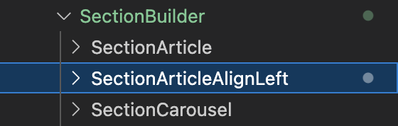
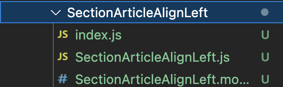
Remember to also rename all files within the new directory from SectionArticle to SectionArticleAlignLeft:
We can now reapply the changes we made in the previous chapter to our new component. First, create a new rule set in SectionArticleAlignLeft.module.css:
.title {
  max-width: 30ch;
}
.ingress {
  max-width: 65ch;
}
And change the SectionArticleAlignLeft.js file to use the new rule set we just created:
 <SectionContainer
     id={sectionId}
     className={className}
     rootClassName={rootClassName}
     background={background}
     options={fieldOptions}
   >
     {hasHeaderFields ? (
       <header className={defaultClasses.sectionDetails}>
-        <Field data={title} className={defaultClasses.title} options={fieldOptions} />
+        <Field data={title} className={css.title} options={fieldOptions} />
-        <Field data={ingress} className={defaultClasses.ingress} options={fieldOptions} />
+        <Field data={ingress} className={css.ingress} options={fieldOptions} />
To see this change live, we will have to import the new component and use the options prop in LandingPage.js:
import SectionArticleAlignLeft from '../../containers/PageBuilder/SectionBuilder/SectionArticleAlignLeft';We can then define an object in LandingPage.js that will be passed on as the options prop:
const sectionOverrides = {
  article: { component: SectionArticleAlignLeft },
};
Let’s pass that object to the PageBuilder component in LandingPage.js as the options prop:
return (
<PageBuilder
pageAssetsData={pageAssetsData?.[camelize(ASSET_NAME)]?.data}
inProgress={inProgress}
error={error}
fallbackPage={<FallbackPage error={error} />}
featuredListings={getFeaturedListingsProps(camelize(ASSET_NAME), props)}
+ options={{sectionComponents: sectionOverrides}}
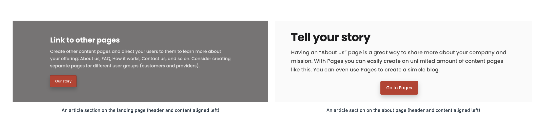
/>When we go to the landing page, we can see that the the template now uses the new component we created to render the section article. This component will only render section articles on the landing page. That is evident when we navigate to any other content page: we will see that titles and content are centred.
Overriding Blocks and Fields
Similar overrides can be made for Blocks and Fields too. For example, if we had wanted to override a Block instead of a Section, we could have used the following mapping:
const blockOverrides = {
  ['defaultBlock']: { component: CustomBlock },
};
And passed it as an options prop:
options={{blockComponents: blockOverrides}}Field overrides can be made similarly. Overriding the H1 tag would be defined using the following structure:
const fieldOverrides = {
  heading1: {
    component: CustomH1,
    pickValidProps: exposeContentAsChildren,
  },
};
Overriding a Field requires passing a function to pickValidProps to ensure data validation. You can import the exposeContentAsChildren function from Field.helpers:
import { exposeContentAsChildren } from '../PageBuilder/Field/Field.helpers';In this case, we would define our custom heading component in the Heading.js file:
export const CustomH1 = React.forwardRef((props, ref) => {
  const { rootClassName: rootClass, as, ...otherProps } = props;
  return (
    <Heading
      rootClassName={rootClass || css.h1custom}
      as={as || 'h1'}
      tagRef={ref}
      {...otherProps}
    />
  );
});
CustomH1.displayName = 'CustomH1';
And export it in the PageBuilder/Primitives/Heading/index.js file:
export { CustomH1, H1, H2, H3, H4, H5, H6 } from './Heading';Finally, we’d pass it on to the options prop in LandingPage.js:
options={{fieldComponents: fieldOverrides}}For a list of which Fields can be overridden, see Field.js .