Create custom search filters in Sharetribe Web Template
The search experience can be improved by adding search filters to narrow down the results. The filters rely on listing indexed data.
There are 3 different UI contexts that render filters. On the mobile
layout, all filters are rendered to a modal inside the
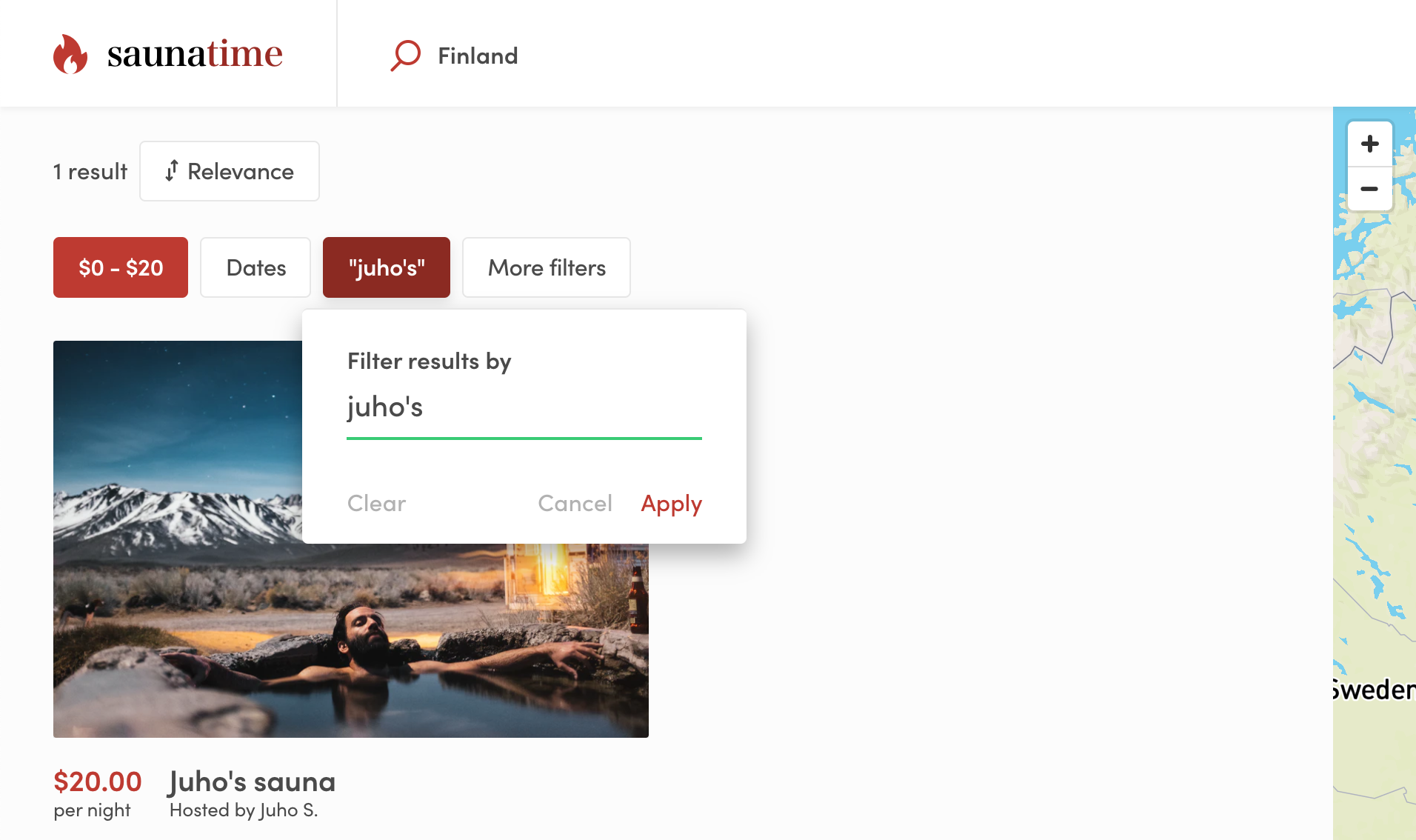
SearchFiltersMobile component. On the desktop layout, the most
important filters are in SearchFiltersPrimary, and extra filters are
in SearchFiltersSecondary panel, which opens when user clicks the
“More filters” button.
Existing filter types
Sharetribe Web Template has several different filter types by default: BookingDateRangeFilter, KeywordFilter, PriceFilter, SelectSingleFilter and SelectMultipleFilter. Select single and select multiple filters are generic – they can be used to filter search results using different kinds of data. The price and date range filters, on the other hand, are only used for filtering by price and date range. Listings with hourly bookings can also be filtered by their availability in a date range with an optional minimum duration. Keyword filter is a special case - more about that later.
SelectSingleFilter and SelectMultipleFilter can be used with
extended data. The SelectSingleFilter can be used to filter out
listings with only one string value in a related public data field. For
instance, a listing’s publicData attribute could contain an attribute
condition: 'new'. The related Marketplace API listing query could then
be made with the query parameter pub_condition=new.
The SelectMultipleFilter, on the other hand, can take multiple values
for a single search parameter. In this case, a listing entity could
contain public data accessories: ['bell', 'lights', 'lock'] and the
query parameter to retrieve that listing among other search results
could be pub_accessories=has_any:bell,mudguard.
Keyword filter
The keyword filter works a bit differently from the other filters. It
does filter search results, but it also sorts those results according to
how strongly the listing’s data (title, description, and possible
extended data) correlates with the search string. Currently, there is no
decay function that would map keyword match correlation with distance to
origin, so the origin param cannot be used at the same time as the
keyword param. You can read more about how the keyword search works in
the related
concepts article.
Because descriptions can be toggled off as a requirement per listing type, some listings may have ‘hidden’ descriptions if this setting changed after the listing was created. The description is still indexed for search and factored into the relevance score.
It is possible to remove location search from topbar and replace it with the keyword search or use them together (without origin param). You can configure the main search type in src/config/configSearch.js.
Search strings with only 1 or 2 letters have a longer timeout before the search query is made.
Creating your own filter types
If you are creating new filter components, note that we are using two different types of components: popup and plain.
Popup components are rendered as primary dropdowns in the map search
view in SearchFiltersPrimary component.
Plain components are used on the grid search page and
SearchFiltersMobile, and with SearchFiltersSecondary on the map
search page. SearchFiltersSecondary opens secondary filters in a
distinct panel in order to fit additional filters to the desktop search
view.
To make creating new filters easier, there are two generic components:
FilterPopup and FilterPlain. These components expect that you give
form fields as child component. This is a simplified example of how the
FilterPlain and FilterPopup components are used in
SelectMultipleFilter.js :
return showAsPopup ? (
  <FilterPopup {...filterPopupProps}>
    <GroupOfFieldCheckboxes
      className={css.fieldGroup}
      name={name}
      id={`${id}-checkbox-group`}
      options={options}
    />
  </FilterPopup>
) : (
  <FilterPlain {...filterPlainProps}>
    <GroupOfFieldCheckboxes
      className={css.fieldGroupPlain}
      name={name}
      id={`${id}-checkbox-group`}
      options={options}
    />
  </FilterPlain>
);
When you have your custom filter component ready, you need to add it to SearchPage/FilterComponent.js:
└── src
    └── containers
        └── SearchPage
            └── FilterComponent.js