Style a component
Introduction
Styling your marketplace is the first step towards customizing its appearance. You can make many visual changes using the no-code tools in Console but for more extensive changes, you will need to edit the code of the Sharetribe Web Template directly. This tutorial teaches you to style components directly through code in the Sharetribe Web Template.
After this tutorial, you will know how to:
- Style components using CSS Modules
- Be familiar with how CSS Modules are used as a part of the Sharetribe Web Template
CSS Modules
The Sharetribe Web Template uses
CSS Modules to style
components. CSS Modules enable modular and scoped styling by generating
unique class names for each CSS module, preventing naming conflicts and
encapsulating styles within specific components. You can find
component-specific CSS styles in files in the component directory with
the extension .module.css.
For example, this is how the folder structure of the Avatar directory looks like:
├── Avatar.example.js
├── Avatar.js
└── Avatar.module.css
In the CSS file (the one ending in .module.css), you can create separate CSS classes for each element you want to style. You don’t have to worry about unique class names, as the CSS Modules library handles naming conflicts by generating unique class names during build time.
Styling a component
In this section, you’ll change the background color of an existing component on the landing page. To do that, we will locate the component we want to edit through the browser’s developer tools and make a change in the CSS file of that component.
You can also adjust the background color of specific sections through Pages in Console . By setting a background color through code, you’ll be setting a default value for the color of the sections, which you can override through Console. If you don’t want to make changes to your code, you can skip this tutorial section and directly edit the color of your sections using Pages.
By default, the background color of the sections on the landing page alternates between white and grey. Our goal is to change the colors to alternate between grey and a light pastel pink.
Let’s start by powering up the development environment by running:
yarn run dev
After that, you should be able to see your marketplace in your browser by navigating to http://localhost:3000
Next, you’ll want to inspect the element you want to modify using the developer console in your web browser.
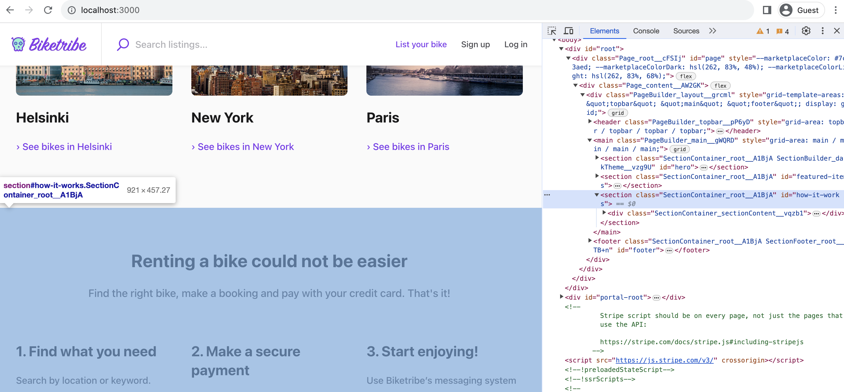
Inspecting elements using your browser’s developer tools is a helpful way of locating the correct component to edit when developing your marketplace.
The element you are looking for is a <section> with the class name
SectionContainer_root and id how-it-works. You’ll notice that the
class name has some additional characters appended to it like
SectionContainer_root_A1BjA. That is the class name generated by CSS
Modules. The random characters added to the end of the class name
guarantee no clashes between classes, even if you use the same class
name to style another component elsewhere in your codebase.
Once you’ve identified the component you want to edit, you can deduce
the correct CSS file based on the class name. The first part of the
class name, SectionContainer, tells us which React component we want
to edit. This information makes it easy for us to locate the correct CSS
file, as all CSS files follow the same naming scheme:
SectionContainer.module.css
Alternatively, you can also directly identify the CSS file you need to
edit by using the developer tools:
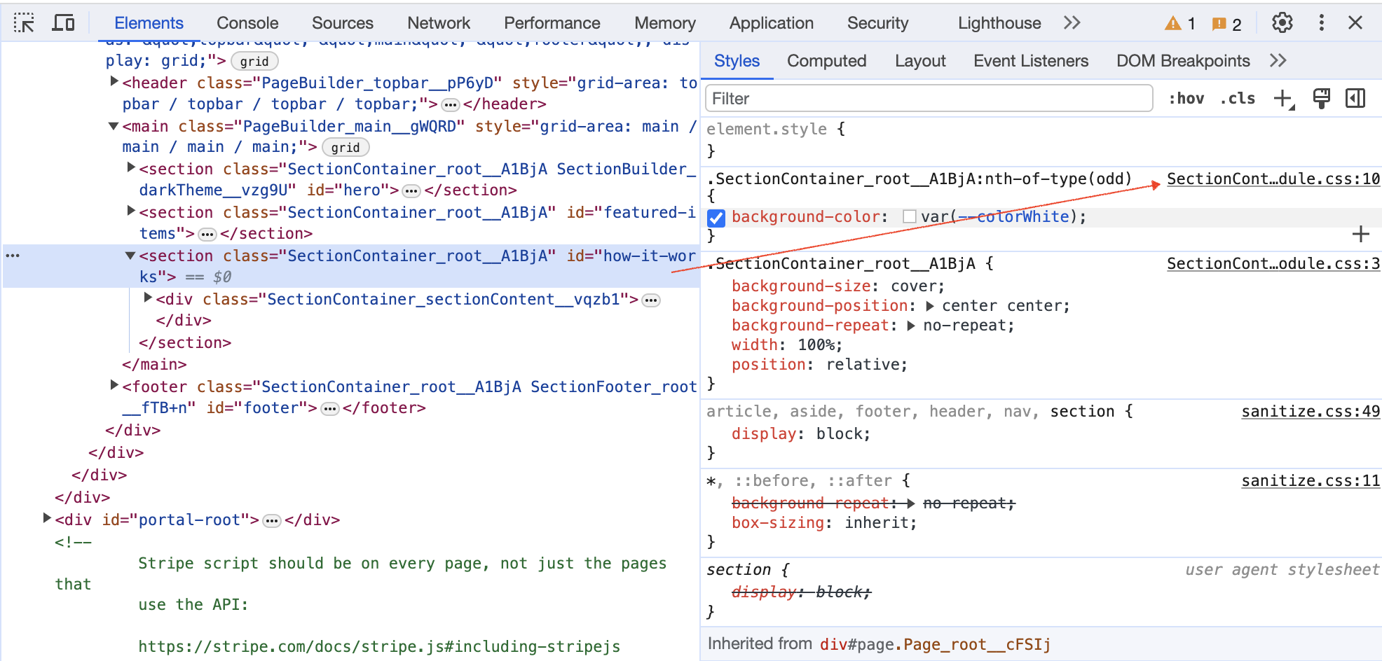
The second part of the class name, root tells us which CSS selector we
want to edit. In SectionContainer.module.css we next identify the
.root selector:
.root {
  background-size: cover;
  background-position: center center;
  background-repeat: no-repeat;
  width: 100%;
  position: relative;

  &:nth-of-type(odd) {
    background-color: var(--colorWhite);
  }
}
The &:nth-of-type(odd) selector targets elements that are the odd-numbered siblings within their parent container. Therefore, the background-color property is applied to every second element on the landing page.
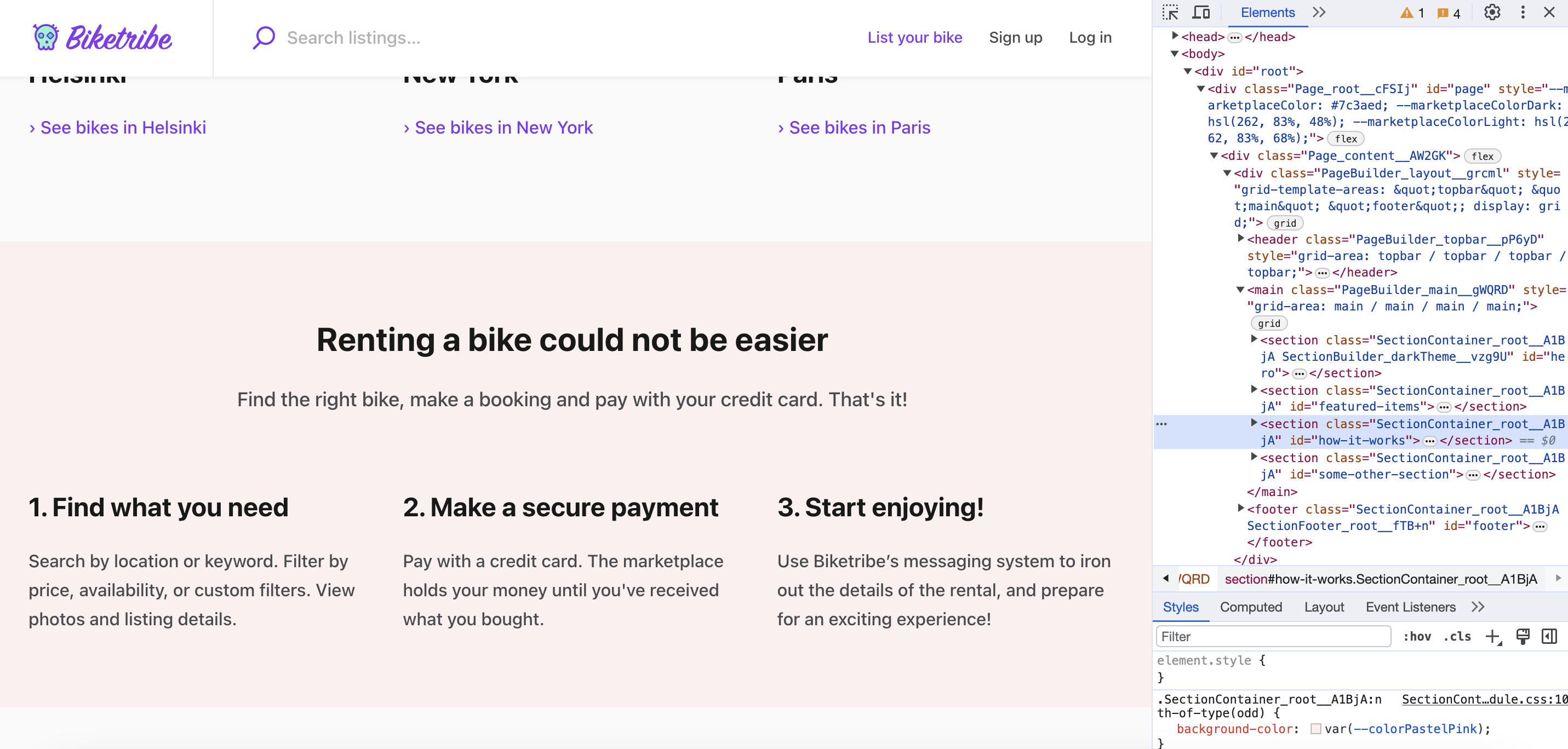
Let’s change the background color to a new color. First, define a new variable in src/styles/marketplaceDefaults.css .
--colorPastelPink: #fbf0ef;And assign it to background-color in SectionContainer.module.css:
  &:nth-of-type(odd) {
    background-color: var(--colorPastelPink);
  }
Now when we refresh the page, we’ll see that the background color of the sections alternates between grey and a pastel pink.
How to assign CSS classes to React Components
You can import classes into your React component .js file using the following syntax:
import css from './SectionContainer.module.css';After that, you can assign classes to React components or HTML elements in your code using the className prop:
className={css.root}Don’t confuse the class attribute of HTML elements and the className prop of React components!
Summary
In this tutorial, you learned how to style components in the Sharetribe Web Template using CSS Modules. The tutorial guided you through identifying the desired component using browser developer tools, locating its corresponding CSS file, and making changes to customize the background color. By following this tutorial, you now know how to customise and style components and how the template uses the CSS modules library.
Further reading
Read more about the CSS architecture used in the Sharetribe Web Template in our Styling and CSS article.