Add a favorite bikes button
In the Biketribe marketplace, we want to enable users to save listings on their favorites list. This way, users can save a list of favorite bikes for the future, even if they don’t want to book immediately.
In this tutorial, you will
- Add a favorite button to the listing page
- Set the button to indicate whether the listing has already been favorited
- Save the favorites to the user’s extended data
- Create a new page, FavoriteListingsPage
This tutorial uses the following no-code marketplace configurations:
Add a favorite button to listing page
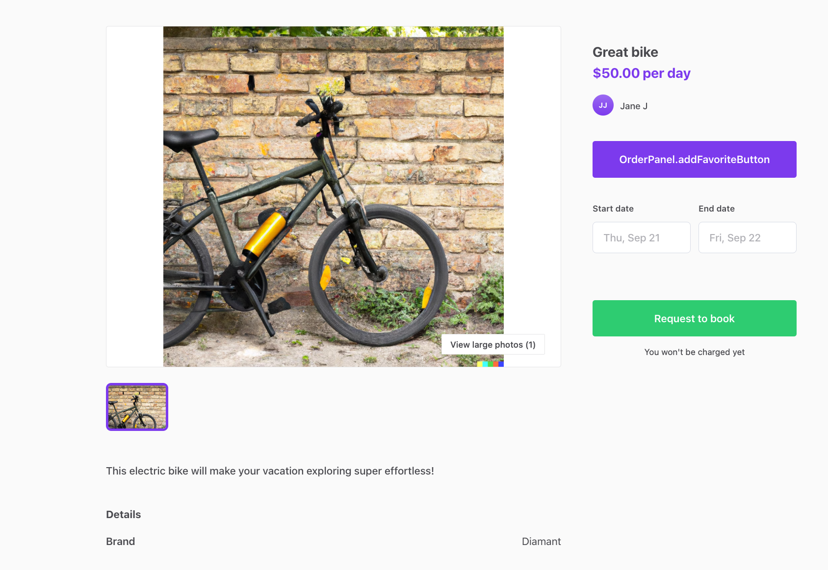
First, we will add a button on each listing so that a signed-in user can favorite that particular listing. In this tutorial, we will add the button to the OrderPanel component, since it is used by both listing page variants.
In addition, the listing’s title is shown in the OrderPanel component, and we want to add the favorite button as close to the listing title as possible.
- OrderPanel.js
- OrderPanel.module.css
First, let’s import the button components. The OrderPanel already imports PrimaryButton, which is used as the “buy” button in the order form, but we want our favorite button to look a bit different, so we will import the components for Button and SecondaryButton as well.
import {
  ModalInMobile,
  PrimaryButton,
  AvatarSmall,
  H1,
  H2,
  Button,
  SecondaryButton,
} from '../../components';
Next, let’s add some props that we will need to build the functionality. We are not yet receiving the props from the parent, so we can expect some errors before we add them to the parent.
  fetchLineItemsInProgress,
  fetchLineItemsError,
  payoutDetailsWarning,
  showListingImage,
  onToggleFavorites,
  currentUser,
} = props;
Then, let’s create a button. We will add the button into a constant,
since we want to show a different button depending on whether the
listing has already been favorited. Add this snippet before the
return ( row in the component.
const isFavorite =
  currentUser?.attributes.profile.privateData.favorites?.includes(
    listing.id.uuid
  );

const toggleFavorites = () => onToggleFavorites(isFavorite);

const favoriteButton = isFavorite ? (
  <SecondaryButton
    className={css.favoriteButton}
    onClick={toggleFavorites}
  >
    <FormattedMessage id="OrderPanel.unfavoriteButton" />
  </SecondaryButton>
) : (
  <Button className={css.favoriteButton} onClick={toggleFavorites}>
    <FormattedMessage id="OrderPanel.addFavoriteButton" />
  </Button>
);
Why does the isFavorite definition contain question marks?
isFavorite definition contain question marks?Above, we define the isFavorite constant like this:
const isFavorite =
  currentUser?.attributes.profile.privateData.favorites?.includes(
    listing.id.uuid
  );
The question marks in between the attributes are optional chaining operators . They are useful in situations where some of the attributes in the chain might not exist.
For instance,
- currentUser does not exist if the user browsing the listing is not signed in
- favorites does not exist if the user is signed in but has not favorited anything yet
The button we added uses a css class favoriteButton. Let’s add it to the end of OrderPanel.module.css.
.favoriteButton {
  margin: 12px 0 36px 0;
}
Finally, we will show this component in the order panel, right under the
author information. Add the {favoriteButton} row under the </div>
with className css.author.
<div className={css.author}>
  <AvatarSmall user={author} className={css.providerAvatar} />
  <span className={css.providerNameLinked}>
    <FormattedMessage
      id="OrderPanel.author"
      values={{ name: authorLink }}
    />
  </span>
  <span className={css.providerNamePlain}>
    <FormattedMessage
      id="OrderPanel.author"
      values={{ name: authorDisplayName }}
    />
  </span>
</div>
{favoriteButton}

{showPriceMissing ? (
Now, you can see the button in the order panel. However, the button text shows the marketplace text key of the message, not the message we want to show.
Let’s fix that by adding all the marketplace texts we need in this tutorial. You can add them in Sharetribe Console > Build > Content > Marketplace texts, or in src/translations/en.js.
"FavoriteListingsPage.loadingFavoriteListings": "Loading listings…",
"FavoriteListingsPage.noResults": "You haven't listed any bikes.",
"FavoriteListingsPage.queryError": "Query failed. Please try again.",
"FavoriteListingsPage.title": "View your favorite bikes",
"FavoriteListingsPage.youHaveListings": "You have {count} favorite {count, plural, one {listing} other {listings}}",
"OrderPanel.addFavoriteButton":"Add to favorites",
"OrderPanel.unfavoriteButton":"Unfavorite",
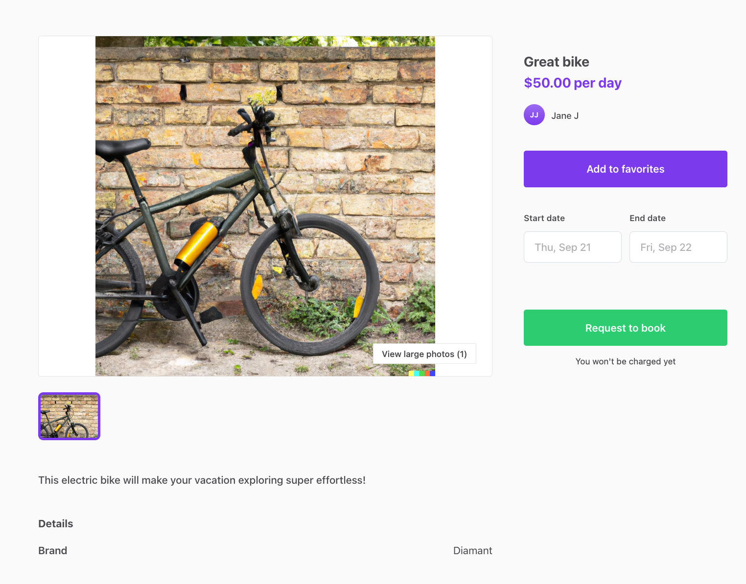
"UserNav.favoriteListings": "Favorite bikes",After adding the marketplace texts and saving your changes, you can refresh your browser and you will see the correct texts in the button.
Clicking the button will not do anything yet, so as the next step, we will create the functionality to favorite a listing.
Save the favorites to the user’s extended data
When the user clicks the favorite button, we want to save that click in the user’s extended data. More specifically, if the listing is not in the user’s favorites list, we want to add it there, and otherwise we want to remove it.
In Sharetribe, user profiles have four types of extended data:
- public data
- public metadata
- protected data
- private data
The first two types are, as the name suggests, public. They are the correct choice when we want other marketplace users to be able to see the data we save. Protected data can only be exposed in the context of a transaction, and private data is only visible to the user themselves.
In this case, we want to use private data, because we do not need to show the user’s favorite listings to other users.
We will add this logic to the listing page files. Since the template has two different listing page components, the functionalities shared by the two different components can be modified and added in the ListingPage.shared.js file.
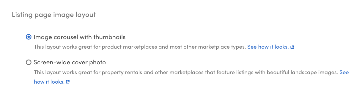
We will then need to import and use those functionalities in the listing page component we are using. Since the layout configuration in our marketplace is Image carousel with thumbnails, the corresponding listing page component is ListingPageCarousel.js.
Finally, we need to pass the necessary props to OrderPanel.js.
If your listing page configuration is Screen-wide cover photo, you will need to modify the component ListingPageCoverPhoto.js instead.
Start by locating the ListingPage.shared.js file:
- ListingPage.shared.js
- ListingPageCarousel.js
First, we will add a handleToggleFavorites function in the ListingPage.shared.js file. If the user is not logged in, we redirect them to the signup page, and otherwise we toggle the listing id in their favorites list.
export const handleToggleFavorites = (parameters) => (isFavorite) => {
  const { currentUser, routes, location, history } = parameters;

  // Only allow signed-in users to save favorites
  if (!currentUser) {
    const state = {
      from: `${location.pathname}${location.search}${location.hash}`,
    };

    // Sign up and return back to the listing page.
    history.push(
      createResourceLocatorString('SignupPage', routes, {}, {}),
      state
    );
  } else {
    const { params, onUpdateFavorites } = parameters;
    const {
      attributes: { profile },
    } = currentUser;
    const { favorites = [] } = profile.privateData || {};

    let payload;

    if (!profile.privateData || !profile.privateData?.favorites) {
      payload = {
        privateData: {
          favorites: [params.id],
        },
      };
    } else if (isFavorite) {
      payload = {
        privateData: {
          favorites: favorites.filter((f) => f !== params.id),
        },
      };
    } else {
      payload = {
        privateData: {
          favorites: [...favorites, params.id],
        },
      };
    }
    onUpdateFavorites(payload);
  }
};
This function receives the necessary information and actions from its parameters, so all we need to know in this function is that we are updating the current user’s private data.
Next, we call this function from ListingPageCarousel.js. We will first import the function we just created.
If your listing page configuration is Screen-wide cover photo, you will need to modify the component ListingPageCoverPhoto.js instead.
In addition, we need to import the Redux action that we will use to actually update the user’s profile. For that, we can use the updateProfile action from ProfileSettingsPage.duck.js.
import {
  LoadingPage,
  ErrorPage,
  handleContactUser,
  handleSubmitInquiry,
  handleNavigateToMakeOfferPage,
  handleNavigateToRequestQuotePage,
  handleSubmit,
  handleToggleFavorites, // add this row to the existing './ListingPage.shared' import
  priceForSchemaMaybe,
  getDerivedRenderData,
} from './ListingPage.shared';

// Add this whole import statement
import { updateProfile } from '../ProfileSettingsPage/ProfileSettingsPage.duck';
What is Redux?
The Sharetribe Web Template uses Redux to manage state. The app stores some information so that it does not need to make API calls to fetch information every time it needs to show something.
In addition, the template uses Redux for SDK and local API calls. This means that containers or components themselves do not make SDK or API calls, and instead they dispatch actions to Redux, and those actions then call the SDK or API and handle the response. This means that those actions can be called from several places in the application.
You can read more about Redux in their documentation .
We cannot call the updateProfile Redux action directly as a function. To dispatch Redux actions from a component, we use the useDispatch hook.
In ListingPageCarousel.js, there are two components. The outer one,
ListingPage, is responsible for wiring up Redux: it calls
useDispatch() to get a reference to the store’s dispatch function, and
then creates a separate callback for each Redux action using React’s
useCallback hook. Those
callbacks are then passed as props to the inner ListingPageComponent,
which does the actual rendering.
We will add onUpdateFavorites in the same way. Find the ListingPage
component — it starts after the ListingPageComponent definition — and
add the new useCallback after the other existing ones.
Add the new callback after the last existing useCallback in
ListingPage (after the onFetchTimeSlots callback):
const onFetchTimeSlots = useCallback(
  (listingId, start, end, timeZone, options) =>
    dispatch(fetchTimeSlots(listingId, start, end, timeZone, options)),
  [dispatch]
);

const onUpdateFavorites = useCallback(
  (payload) => dispatch(updateProfile(payload)),
  [dispatch]
);

return (
  <ListingPageAccessWrapper
Then pass it as a prop to ListingPageAccessWrapper inside the return
of ListingPage, alongside the other existing props:
return (
  <ListingPageAccessWrapper
    {...props}
    onUpdateFavorites={onUpdateFavorites}
    {/* ...all other existing props stay as they are */}
  />
We can give our prop a descriptive name, such as onUpdateFavorites, since in this component we are only using it for that purpose.
Now that the ListingPage creates onUpdateFavorites and passes it as a prop, ListingPageCarousel props can receive and use it. Let’s add it to the destructured list in the beginning of the component.
    onInitializeCardPaymentData,
    config,
    routeConfiguration,
    showOwnListingsOnly,
    onUpdateFavorites, // add this row
    ...restOfProps
  } = props;
Now, we can add a function that we can pass to OrderPanel as the
onToggleFavorites prop. Add the following block before the return (
statement of the component.
const onToggleFavorites = handleToggleFavorites({
  ...commonParams,
  currentUser,
  onUpdateFavorites,
  location,
});
Finally, we can pass the necessary props to OrderPanel to connect the functionality with the button we created earlier. Add the currentUser and onToggleFavorites props to the OrderPanel component in ListingPageCarousel.
<OrderPanel
className={classNames(css.productOrderPanel, {
[css.imagesEnabled]: showListingImage,
})}
listing={currentListing}
isOwnListing={isOwnListing}
currentUser={currentUser}
onToggleFavorites={onToggleFavorites}
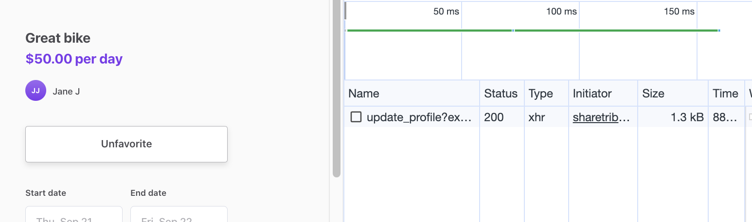
/>Now, when you navigate to a listing’s page and open your Dev Tools Network tab , you can see that each click of the button triggers an update_profile network call that saves the click information.
How does the network call propagate to the button?
The flow of the data happens like this:
- User clicks the button and triggers the handleToggleFavorites function
- the handleToggleFavorites function dispatches the Redux action to update the current user’s profile
- the Redux action updateProfile calls the sdk.currentUser.updateProfile endpoint with the payload containing privateData.favorites
- when the sdk call succeeds, it returns the updated currentUser resource
- the Redux action then calls updateProfile, which updates the currentUser in the store with the updated resource
- the currentUser prop that we pass from ListingPageCarousel to OrderPanel is mapped to Redux state, so any changes to currentUser in state are immediately reflected in the prop
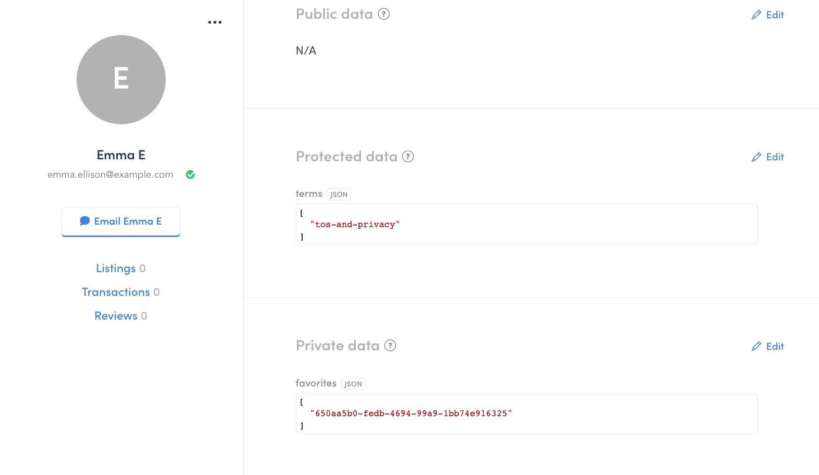
You can also verify this in Sharetribe Console – navigate to Manage > Users and find the details card of the user with whom you favorited the listing. You can see in their Private data that the user now has a favorites list with this listing’s id.
Create FavoriteListingsPage
In addition to seeing the favorite status on the individual listing’s page, we want to show all favorited listings on a separate page. For that reason, let’s make a new page called FavoriteListingsPage.
First, let’s add a new folder to containers directory for FavoriteListingsPage, and create three new files:
- FavoriteListingsPage.js
- FavoriteListingsPage.duck.js
- FavoriteListingsPage.module.css
You can download the files here:
FavoriteListingsPage.js explained
FavoriteListingsPage.js explainedThis section will go through FavoriteListingsPage.js in more detail.
First, we import the necessary elements used in the file. In this section, all rows start with import.
Then, we create the component itself. We first use destructuring assignment to get the container state into constants for ease of use.
We also create a few other constants to then pass to the returned element. Some of those constants are simple values, others are more complex elements.
const FavoriteListingsPage = props => {
  const intl = useIntl();

  const {
    currentPageResultIds,
    pagination,
    queryInProgress,
    queryFavoritesError,
    queryParams,
  } = useSelector(state => state.FavoriteListingsPage);

  const listings = useSelector(state => getListingsById(state, currentPageResultIds));
  const scrollingDisabled = useSelector(state => isScrollingDisabled(state));

  const hasPaginationInfo = !!pagination && pagination.totalItems != null;
  const listingsAreLoaded = !queryInProgress && hasPaginationInfo;

  const loadingResults = (
    <div className={css.messagePanel}>
      <H3 as="h2" className={css.heading}>
        <FormattedMessage id="FavoriteListingsPage.loadingFavoriteListings" />
      </H3>
    </div>
  );

  const queryError = (
    <div className={css.messagePanel}>
      <H3 as="h2" className={css.heading}>
        <FormattedMessage id="FavoriteListingsPage.queryError" />
      </H3>
    </div>
  );

  const noResults =
    listingsAreLoaded && pagination.totalItems === 0 ? (
      <H3 as="h1" className={css.heading}>
        <FormattedMessage id="FavoriteListingsPage.noResults" />
      </H3>
    ) : null;

  const heading =
    listingsAreLoaded && pagination.totalItems > 0 ? (
      <H3 as="h1" className={css.heading}>
        <FormattedMessage
          id="FavoriteListingsPage.youHaveListings"
          values={{ count: pagination.totalItems }}
        />
      </H3>
    ) : (
      noResults
    );

  const page = queryParams ? queryParams.page : 1;
  const paginationLinks =
    listingsAreLoaded && pagination && pagination.totalPages > 1 ? (
      <PaginationLinks
        className={css.pagination}
        pageName="FavoriteListingsPage"
        pageSearchParams={{ page }}
        pagination={pagination}
      />
    ) : null;

  const title = intl.formatMessage({ id: 'FavoriteListingsPage.title' });

  const panelWidth = 62.5;
  // Render hints for responsive image
  const renderSizes = [
    `(max-width: 767px) 100vw`,
    `(max-width: 1920px) ${panelWidth / 2}vw`,
    `${panelWidth / 3}vw`,
  ].join(', ');
Then, we return the actual page. We use the Page and LayoutSingleColumn components to wrap our Favorites page specific content, and to show the topbar and footer elements.
Inside the layout component, we first show a loading indicator or an error message, if either exists. Then, we map our array of favorited listings into ListingCard components to display them on the page. Finally, we show a pagination element, if the listing array has more than one page of listings.
  return (
    <Page title={title} scrollingDisabled={scrollingDisabled}>
      <LayoutSingleColumn
        topbar={
          <>
            <TopbarContainer />
            <UserNav currentPage="FavoriteListingsPage" />
          </>
        }
        footer={<FooterContainer />}
      >
        {queryInProgress ? loadingResults : null}
        {queryFavoritesError ? queryError : null}
        <div className={css.listingPanel}>
          {heading}
          <div className={css.listingCards}>
            {listings.map(l => (
              <ListingCard
                className={css.listingCard}
                key={l.id.uuid}
                listing={l}
                renderSizes={renderSizes}
              />
            ))}
          </div>
          {paginationLinks}
        </div>
      </LayoutSingleColumn>
    </Page>
  );
};
Finally, we export the component as the default export.
export default FavoriteListingsPage;FavoriteListingsPage.duck.js explained
FavoriteListingsPage.duck.js explainedThis section will go through FavoriteListingsPage.duck.js in more detail.
First, we import the necessary elements, and define the result page size.
Then, we start creating the different elements using Redux Toolkit :
We define initial state and a helper function resultIds:
const initialState = {
  pagination: null,
  queryParams: null,
  queryInProgress: false,
  queryFavoritesError: null,
  currentPageResultIds: [],
};

const resultIds = (data) => data.data.map((l) => l.id);
We then create a slice where we define the initial state, an object of
reducer functions, and a “slice name”. The slice automatically generates
action creators and action types that correspond to the reducers and
state. The slice handles three different outcomes:
- pending
- fulfilled
- rejected
const favoriteListingsSlice = createSlice({
  name: 'FavoriteListingsPage',
  initialState: initialState,
  extraReducers: (builder) => {
    builder
      .addCase(queryFavoriteListingsThunk.pending, (state, action) => {
        state.queryParams = action.meta.arg;
        state.queryInProgress = true;
        state.queryFavoritesError = null;
        state.currentPageResultIds = [];
      })
      .addCase(
        queryFavoriteListingsThunk.fulfilled,
        (state, action) => {
          state.currentPageResultIds = resultIds(action.payload.data);
          state.pagination = action.payload.data.meta;
          state.queryInProgress = false;
        }
      )
      .addCase(queryFavoriteListingsThunk.rejected, (state, action) => {
        console.error(action.payload || action.error);
        state.queryInProgress = false;
        state.queryFavoritesError = action.payload;
      });
  },
});

export default favoriteListingsSlice.reducer;
Finally, we create our thunk to call the SDK. The main SDK call we want to make on this page is fetching listings based on the user’s favorite listings.
The structure of the thunk serves an example of most of the thunks in the Sharetribe Web Template.
- Set up SDK call parameters
- Make SDK call
- For a successful SDK response, handle the response data and return a fulfilled status – this again sets a selection values in state, which the page can use to stop loading indication and display the data
- In case of an error, return
rejectWithValueand a rejected status, which will store a selection of values in state that the page can use to stop loading indication and display an error message.
export const queryFavoriteListingsPayloadCreator = (
  queryParams,
  { extra: sdk, dispatch, rejectWithValue, getState }
) => {
  const { currentUser } = getState().user;
  const { favorites } =
    currentUser?.attributes.profile.privateData || {};

  const favoritesMaybe = favorites ? { ids: favorites } : {};
  const { perPage, ...rest } = queryParams;
  const params = { ...favoritesMaybe, ...rest, perPage };

  return sdk.listings
    .query(params)
    .then((response) => {
      dispatch(addMarketplaceEntities(response));
      return response;
    })
    .catch((e) => {
      return rejectWithValue(storableError(e));
    });
};

export const queryFavoriteListingsThunk = createAsyncThunk(
  'app/FavoriteListingsPage/queryFavoriteListings',
  queryFavoriteListingsPayloadCreator
);
In addition to the queryFavoriteListings thunk, we export a loadData function that gets called when the page loads, which in turn calls the queryFavoriteListings thunk to initiate the listing fetching process.
Now, since we are creating a new container with a new Redux file, we will need to take it into use in reducers.js as well.
- reducers.js
Add an import and an export for FavoriteListingsPage in the reducers.js file.
import FavoriteListingsPage from './FavoriteListingsPage/FavoriteListingsPage.duck';

export {
  CheckoutPage,
  ContactDetailsPage,
  EditListingPage,
  FavoriteListingsPage,
Next, in order to show the page in a specific route, we need to add a route and a data loading function. We will do this in the following files:
- pageDataLoadingAPI.js
- routeConfiguration.js
Add import for FavoriteListingsPageLoader, and a new property in the return object, in pageDataLoadingAPI.js.
import { loadData as FavoriteListingsPageLoader } from './FavoriteListingsPage/FavoriteListingsPage.duck';
…
const getPageDataLoadingAPI = () => {
  return {
    AuthenticationPage: {
      loadData: AuthenticationPageLoader,
    },
    …
    FavoriteListingsPage: {
      loadData: FavoriteListingsPageLoader,
    },
Then, add a new route in routeConfiguration.js. Again, we first need to import the page, and then we add an object specifying the path and the necessary elements, including the load data function we just added to pageDataLoadingAPI.
const FavoriteListingsPage = loadable(() => import(/* webpackChunkName: "FavoriteListingsPage" */ '../containers/FavoriteListingsPage/FavoriteListingsPage'));
…
return [
{
path: '/',
name: 'LandingPage',
component: LandingPage,
loadData: pageDataLoadingAPI.LandingPage.loadData,
},
…
{
path: '/favorites',
name: 'FavoriteListingsPage',
auth: true, // user must be signed in to view this page
authPage: 'LoginPage',
component: FavoriteListingsPage,
loadData: pageDataLoadingAPI.FavoriteListingsPage.loadData,
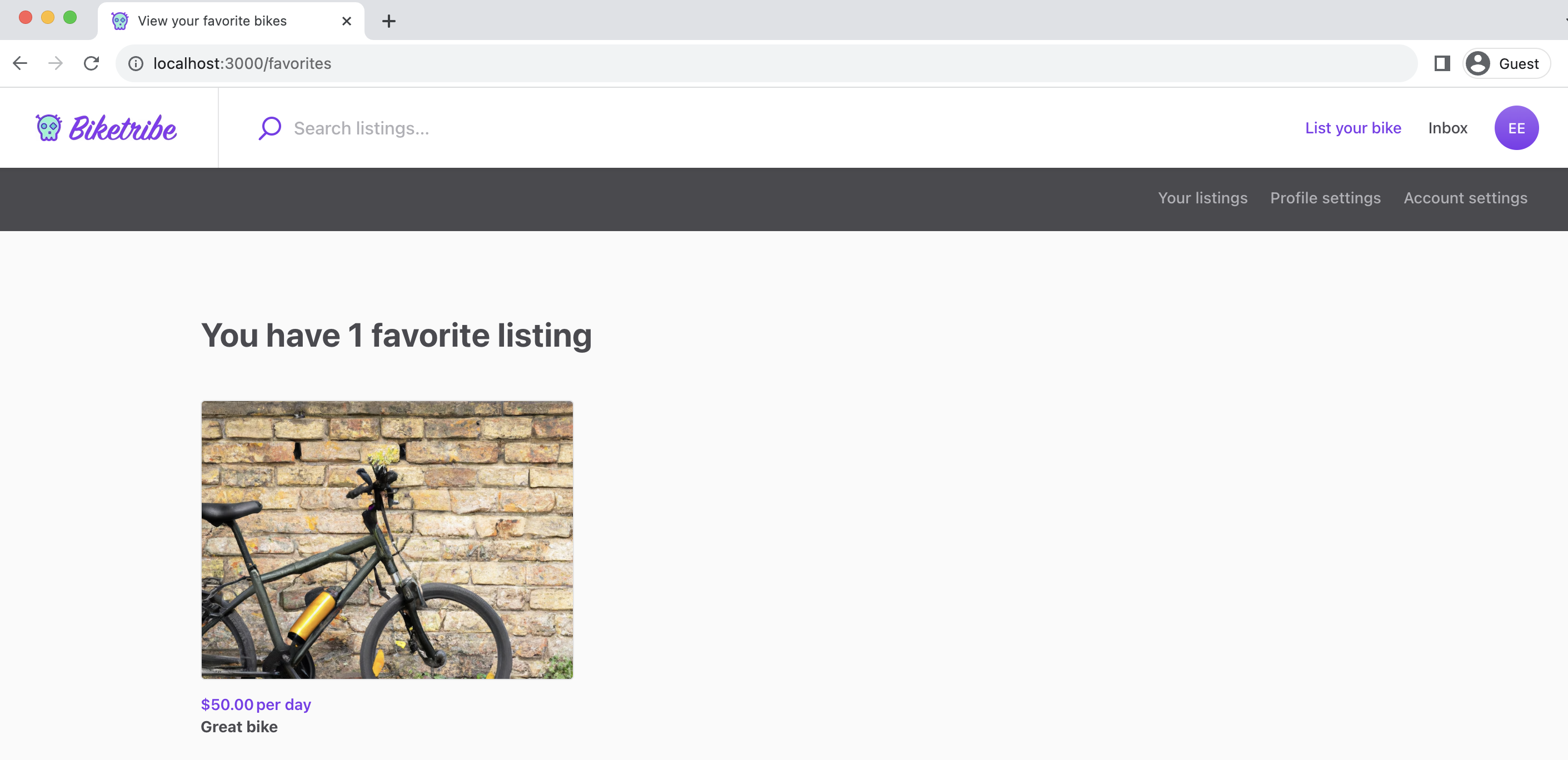
},Now, when you navigate to localhost:3000/favorites, you can see your
favorited listings.
Add navigation
As the final step, we will add our new favorite listings page into the navigation elements of the page – Topbar and UserNav.
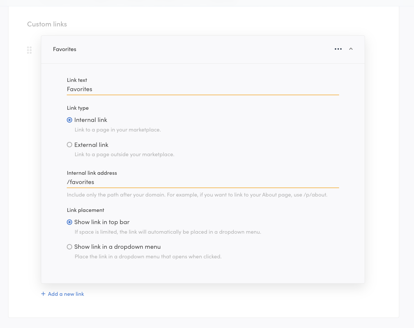
You can add a link to Topbar in Console > Build > Content > Top bar .
└── src
    └── components
        └── UserNav
└── UserNav.js- userNav.js
The last addition comes to the UserNav component.
When we click on the the link for favorite listings, we get to the page. However, the user navigation bar does not show the favorite listings page.

Let’s add the link next. Open the UserNav.js file and replace the tabs array with the following code:
const tabs = [
  ...manageListingsTabMaybe,
  {
    text: <FormattedMessage id="UserNav.favoriteListings" />,
    selected: currentPage === 'FavoriteListingsPage',
    linkProps: {
      name: 'FavoriteListingsPage',
    },
  },
  {
    text: <FormattedMessage id="UserNav.profileSettings" />,
    selected: currentPage === 'ProfileSettingsPage',
    disabled: false,
    linkProps: {
      name: 'ProfileSettingsPage',
    },
  },
  {
    text: <FormattedMessage id="UserNav.accountSettings" />,
    selected: ACCOUNT_SETTINGS_PAGES.includes(currentPage),
    disabled: false,
    linkProps: {
      name: 'ContactDetailsPage',
    },
  },
];
Now, when you save the file and refresh the app, you will see a link to Favorite bikes in between the links for your listings and profile settings.
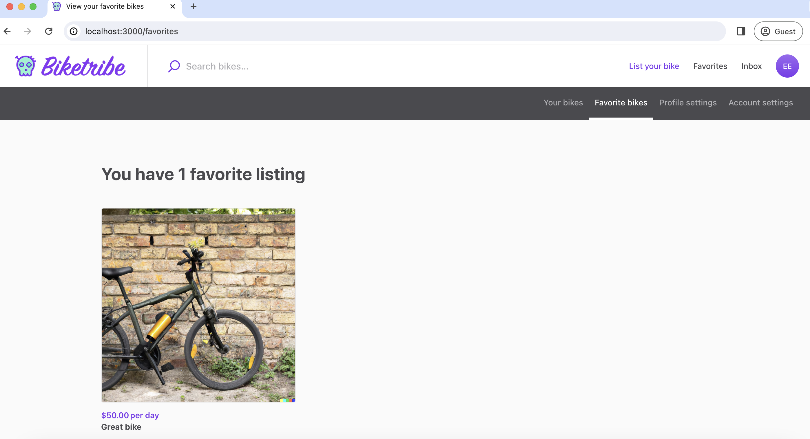
And that’s it! The Biketribe marketplace now allows users to set listings as favorites and view them on a separate page.
Summary
In this tutorial, you have
- Added a button element to OrderPanel that shows up differently based on whether the listing has been favorited
- Added a shared listing page function for updating the user’s extended data
- Created a new page called FavoriteListingsPage and set up the correct routing for it
- Added the new page to the top bar profile menu and user navigation bar