Last updated
Styling and CSS
This guide describes the CSS architecture used in the Sharetribe Web Template and how to apply changes to the styling using CSS.
Table of Contents
The goal for the template was to keep stylesheets as close as possible to plain CSS while still trying to avoid the mess that comes along with the globally defined cascading behaviour.
To tackle this goal, we have split the styling into two levels:
- Marketplace level styling with 3 global
stylesheets:
- src/styles/marketplaceDefaults.css (contains CSS variables, element styles, and global CSS classes)
- src/styles/customMediaQueries.css (contains breakpoints for responsive layout)
- Component level styling using CSS Modules
Marketplace level styling
Marketplace-level styling refers to global styles used across the
template. The stylesheets presented in this section contain variables
such as marketplaceColor, which defines the primary colour used in
many icons and fonts across the marketplace.
└── src
    └── styles
        ├── customMediaQueries.css
        └── marketplaceDefaults.css
We have created marketplace-level styling variables with CSS Properties (vars) and a few global CSS classes.
The concept behind
CSS Properties
is quite straightforward - they are variables that can be defined in
root-element level (<html>) and then used inside some CSS rule.
/* in src/styles/marketplaceDefaults.css */
:root {
  --marketplaceColor: #ffff00;
}
/* in component.module.css */
.linkToHomePage {
color: var(--marketplaceColor);
}Read more about CSS Properties from MDN.
customMediaQueries.css
Breakpoints for media queries are defined in customMediaQueries.css.
@custom-media --viewportSmall (min-width: 550px);
@custom-media --viewportMedium (min-width: 768px);
@custom-media --viewportLarge (min-width: 1024px);
// etc.
These custom media query breakpoints can be used in a similar way as CSS Properties. However, these variables are converted to real media queries during build-time.
@media (--viewportMedium) {
  /* CSS classes */
}
On a live site, the CSS file contains:
@media (min-width: 768px) {
  /* CSS classes */
}
marketplaceDefaults.css
This is a good place to start customizing marketplace styles. For example, we define our color scheme here using CSS Property variables:
/* ================ Colors ================ */

--colorSuccess: #2ecc71;
--colorSuccessDark: #239954;
--colorSuccessLight: #f0fff6;
--colorFail: #ff0000;
--colorFailLight: #fff0f0;
--colorAttention: #ffaa00;
--colorAttentionLight: #fff7f0;
--colorBannedLight: var(--marketplaceColorLight);
--colorBannedDark: var(--marketplaceColor);
--colorSuccess (green) is used in form inputs for showing that the
input value is valid.
Similarly --colorFail is used to style errors and --colorAttention
is used to draw user's attention to certain UI components (e.g. required
form inputs, or important info in Inbox).
It is good to note that there are also colors that are defined in the
Console, and fetched to the template in the hosted asset
/design/branding.json. These include --marketplaceColor and
--colorPrimaryButton. Any values set in Console override the values
defined in the template by default.
Our greyscale colors (for borders and background colors) are named with prefix "matter".
Similar pattern is also used to create more consistent UI components by providing variables for box-shadows, border-radiuses, transitions, and so on. Our current plan is to parameterize styling even more using this concept.
In addition, this file provides default styles for plain elements like
<body>, <a>, <p>, <input>, <h1>, <h2>, and so on. There are
also some global CSS classes that components can use.
Global CSS classes
Fonts and some other shared styles are specified in the marketplaceDefaults.css file using global (vanilla) CSS classes. They provide us a way to share some generic styles between components.
For example, our default font is defined as:
.marketplaceDefaultFontStyles {
  font-family: var(--fontFamily);
  font-weight: var(--fontWeightMedium);
  font-size: 14px;
  line-height: 24px;
  letter-spacing: -0.1px;
  /* No margins for default font */

  @media (--viewportMedium) {
    font-size: 16px;
    line-height: 32px;
  }
}
The new class can be used inside a component's CSS Module syntax:
.tip {
  composes: marketplaceDefaultFontStyles from global;
}Information
The template app follows a pattern where the height of an element should be divisible by 6px on mobile layout and 8px on bigger layouts. This also affects line-heights of font styles.
Fonts
You can find all font-related rule sets from the
marketplaceDefaults.css
file. The default font is defined in the --fontFamily
CSS variable.
The template uses either the Mac OS system font or
Inter if any other operating
system is in use. Even though Inter is a Google Font, it gets served
through the Sharetribe CDN for performance reasons. The
public/index.html
is responsible for actually loading the fonts into the application.
If you want to change the font, you must make changes to both marketplaceDefaults.css and public/index.html. If you're interested in different font-loading strategies, see these links:
- https://www.zachleat.com/web/comprehensive-webfonts/
- https://css-tricks.com/the-best-font-loading-strategies-and-how-to-execute-them/
Styling components
Styling a web UI is traditionally quite a messy business due to the
global nature of stylesheets and especially their cascading specificity
rule. .card {/*...*/} will affect every element on a web page that has
a class "card" - even if the different UI context would like to use
a different set of rules.
Our goal has been to create independent components that can be reused in the UI without paying too much attention to the global CSS context. To achieve this, we have used CSS Modules, which keeps the syntax close to plain CSS, but it actually creates unique class names to remove the problems caused by the global nature of CSS. In practice, this means that a class with name card is actually renamed as ComponentName_card__3kj4h5.
To use styles defined in SectionHero.module.css, we need to import the file into the component:
import css from './SectionHero.module.css';and then select the correct class from imported style object (in this case heroMainTitle):
<h1 className={css.heroMainTitle}>Book saunas everywhere</h1>Finding a component
Quite often one needs to find a component that is responsible for certain UI partial in order to change the styles. In this case, the easiest way to pinpoint a component is to open the inspector from browser's dev tools. Right-click on top of the correct element, and select Inspector, or something of the sort depending on the browser, from the context menu.
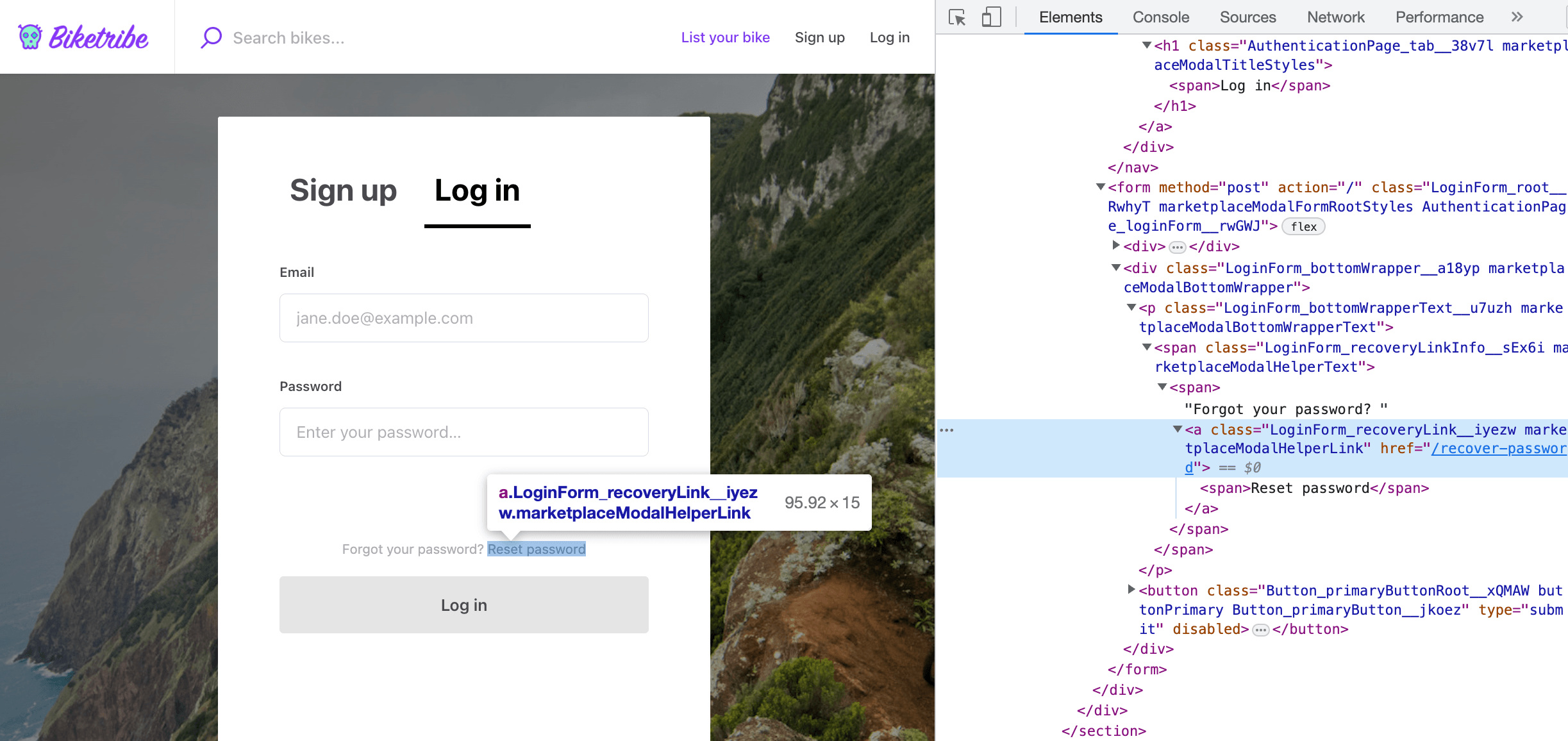
Here we have opened Authentication Page forgot password link:
<a
  class="LoginForm_recoveryLink__iyezw marketplaceModalHelperLink"
  href="/recover-password"
>
  <span>Reset password</span>
  <a></a
></a>
Styles are defined in a "class" called
LoginForm_recoveryLink__iyezw. As stated before, the first part of
a class name is actually giving us a hint about what component is
defining that style - in this case, it's LoginForm and its styles can
be found from the file: LoginForm.module.css.
└── src
    └── containers
        └── AuthenticationPage
            └── LoginForm
               └── LoginForm.js
               └── LoginForm.module.css
Styling guidelines
We have a practice of naming the outermost class of a component as
.root { /* styles */ }. So, if the component is just rendering single
element it only has .root class, and if there's more complex inner
DOM structure needed, additional classes are named semantically.
<LoginForm> could contain classes named as .root, .password,
.recoveryLink.
Some guidelines we have tried to follow:
- Use semantic class names
They improve readability and decouples style changes from DOM changes. - Use the
CSS Properties
defined in marketplaceDefaults.css
and create new ones when it makes sense. - Use classes, don't style DOM elements directly.
Element styles are global even with CSS Modules. - Avoid nesting styles.
CSS Modules makes specificity rules unnecessary. - Group and comment style rules inside declaration block if that improves readability.
- Parent component is responsible for allocating space for a child component (i.e. dimensions and margins).
- Define
composesdeclarations early enough inside the declaration block.
Be careful: rules inside those global CSS declarations might overwrite rules written inside the component's own class. This depends on the specificity given in the global (vanilla) CSS file. - Align text and components to horizontal baselines. I.e. they should be a multiple of 6px on mobile layout and 8px on bigger screens.
- Component height should follow baselines too.
I.e. they should be a multiple of 6px on mobile layout and 8px on bigger screens. (Unfortunately, we haven't been strict with this one.)
Parent vs child
One important aspect of a component-based UI is the fact that a component is usually only responsible for what happens inside its outermost element boundary. In parent-child context this means that the parent component is responsible for its own layout and therefore it usually needs to be able to give some dimensions to its child components (and naturally margins between them).
This creates a need for the parent to have means to pass className to its child as props. One example could be a component that shows a circle component inside itself and makes it 50px wide.
Style definitions of the (<Circle />) child component:
.root {
  background-color: tomato;
  border-radius: 50%;
}
Parent component could render something like:
<div className={css.root}>
  <Circle className={css.circleDimensions} />
</div>
and it uses classes:
.root {
  min-width: 60px;
  min-height: 60px;
  display: flex;
  align-items: center;
  justify-content: center;
}

.circleDimensions {
  flex-grow: 0;
  width: 50px;
  height: 50px;
  margin: 5px;
}
Sometimes the child component needs to be styled even further than just allocating space to it. If the parent component wants to change the theme of child component there are generally two concepts available:
- Create themed components (e.g.
<PrimaryButton>,<SecondaryButton>,<InlineButton>) - Pass in a class property that is able to overwrite original styling rules.
For the latter option, we have created a prop type concept called
rootClassName. If you pass rootClassName through props to a
component, it will use that instead of component's own style rules
defined in .root. This ensures that the order of style declarations
inside final CSS bundle doesn't affect the final styles. (CSS bundle is
generated in an import order, therefore we want to avoid situations
where <Component className="classA classB"/> could end up overwriting
each others depending on the order they are imported.)
import React from 'react';
import css from './MyComponent.module.css';

export const MyComponent = props => {
  const { className, rootClassName } = props;
  const classes = classNames(rootClassName || css.root, className);
  return <div className={classes}>Hello World</div>;
};
In some complex cases, we have also created props for overwriting some
inner classes of child components. In these cases, child component is
also replacing its own styling class with the class passed-in through
props. For example, <LocationAutocompleteInput> can take a prop called
iconClassName, which (if given) replaces .icon class defined
inside LocationAutocompleteInput.module.css.
Using vanilla CSS
The Sharetribe Web Template does not use vanilla CSS, but it is possible
to take vanilla CSS into use just by creating CSS file that doesn't use
*.module.css pattern in its file name.
Read more about using vanilla CSS from Create React App's docs.