Last updated
Change Logo
Learn how to change the logo and how components in Flex Template for Web are styled.
Table of Contents
Change Logo component
Components can be found from one of the three directories:
- containers: Page-level components and TopbarContainer are Redux container components.
- forms: Form components. (These use Final Form.)
- components: Other presentational components.
Logo is a presentational component and it can be found from components directory:
└── src
    ├── components
    │   └── Logo
    │       ├── IconLogo.js
    │       ├── Logo.module.css
    │       ├── Logo.js
    │       └── saunatime-logo.png
    ├── containers
    └── forms
The main component has the same name as the directory it lies: Logo/Logo.js. If you open that file, you'll notice that it imports 2 logo-files from the same directory:
import IconLogo from './IconLogo';
import LogoImage from './saunatime-logo.png';
The first one (IconLogo) doesn't have a file extension, which means that it's referring to IconLogo.js file. If you open it, you see that it contains Scalable Vector Graphics (SVG) content inside React component.
The other import (LogoImage) is referring to a normal PNG image.
IconLogo is used for mobile layout and PNG is for desktop layout. There's no real reason behind this double format setup - it is just there to show 2 different ways to create graphics. Although, the SVG format is a bit better choice for logo since it stays sharp when scaled bigger.
However, in this tutorial, we'll use raster images (PNGs):
Save those files to Logo directory, and then change the imports:
import MobileLogoImage from './cottagedays-logo-small.png';
import DesktopLogoImage from './cottagedays-logo.png';
You also need to change the places where the previously imported logos
were used. Since we use PNGs in this tutorial, we just need plain
<img> elements. Therefore, we can simplify the function component a
bit.
First of all, class .logoMobile (inside Logo.css) needs to be changed. Previously, it just adjusted styles for SVG paths, which we don't have anymore. However, IconLogo component had a height explicitly defined in its props. It was 25px tall, so we should use that.
.logoMobile {
  height: 25px;
}
Then we can simplify the Logo component itself:
const Logo = props => {
  const { className, format, ...rest } = props;
  const isMobile = format !== 'desktop';
  const classes = classNames(className, { [css.logoMobile]: isMobile });
  const logoImage = isMobile ? MobileLogoImage : DesktopLogoImage;

  return (
    <img
      className={classes}
      src={logoImage}
      alt={config.siteTitle}
      {...rest}
    />
  );
};import React from 'react';
import { oneOf, string } from 'prop-types';
import classNames from 'classnames';
import config from '../../config';
import MobileLogoImage from './cottagedays-logo-small.png';
import DesktopLogoImage from './cottagedays-logo.png';
import css from './Logo.module.css';
const Logo = props => {
const { className, format, ...rest } = props;
const isMobile = format !== 'desktop';
const classes = classNames(className, { [css.logoMobile]: isMobile });
const logoImage = isMobile ? MobileLogoImage : DesktopLogoImage;
return (
<img
className={classes}
src={logoImage}
alt={config.siteTitle}
{...rest}
/>
);
};
Logo.defaultProps = {
className: null,
format: 'desktop',
};
Logo.propTypes = {
className: string,
format: oneOf(['desktop', 'mobile']),
};
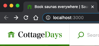
export default Logo;After those changes, you should see the updated Logo:
Logo component is used in several places. Check these locations to verify that your changes don't break anything:
- Topbar - Both desktop and mobile layout. The breakpoint is at 768px.
- Footer
- CheckoutPage - This page has its own Topbar component.
Troubleshooting
If your logo has a completely different aspect ratio, you might need to change the paddings and other styles that are used to style the parent component of the Logo. E.g. you might need to adjust the paddings so that the component doesn't overflow from the area reserved for Topbar.
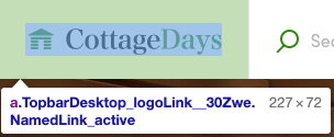
The easiest way to figure out styles related to any component is to use the browser's Web Inspector and check the classes that affect the component.
Useful tip:
FTW templates use
CSS Modules instead of
plain CSS for styling components. CSS Modules creates unique class names
for the rendered component - and those class name strings are in format:
<ComponentName>_<className>__<hash>.
So, you can backtrack the correct component from the class name. In the example image above: the component which provides the paddings rule is TopbarDesktop.
Styling other components
Creating a new visual brand needs a lot of changes to existing
components. You should read the following article to understand how
to customize FTW styles:
How to customize FTW styles
Especially, you should check the best practices topic to check the philosophy of how the existing components are styled.
While you are styling components, you also need to change some
copy-texts in them. In the next article, we'll change the copy-texts of
Topbar component.
› Go to the next article

