[Developer Blog](/developer-blog/)
# Custom section components on Sharetribe’s CMS, Pages
Sharetribe marketplaces offer a simple CMS tool that operators can use to create content in their marketplaces without coding. This article discusses two ways to enhance the default display of CMS page components in Sharetribe Web Template.
Apr 11, 2024
[](/author/sari-saariaho/)
Sari Saariaho
Developer Advocacy Guild Lead
**Note: The implementation in this article is built on top of [Sharetribe Web Template v4.1.2](https://github.com/sharetribe/web-template/releases/tag/v4.1.2), so if you are working on a later version, you may need to make some adjustments.**
Sharetribe marketplaces offer a simple CMS tool, Pages, that operators can use to create content in their marketplaces through Console, without needing to update code. The Sharetribe Web Template has a default way to display the content created in Console. In addition, you can add custom sections for different use cases in your code base.
There are two main ways to use custom CMS sections in your code:
* You can add custom handling for a specific Console-based section based on the section id
* You can hard-code a custom section on the page you want
There are advantages and disadvantages to each approach.
If you create custom handling for a Console-based section, operators have more freedom to modify the section content. The caveat is that you need to carefully coordinate that the operator uses a specific sectionId on that section, and only that section. Debugging potential errors also becomes tricky, because you need to cross-reference information between the codebase and Console page sections.
If you hard-code a custom section on a page, changing it always requires code changes. On the other hand, once the feature has been developed, there are no outside influences that might break it, unlike with the Console-based section. This is a good option when any data shown in the section can be fetched directly from the Sharetribe APIs and does not need to rely on Console configurations.
In this article, I will show an example of both cases. You can also read more about [passing custom sections to PageBuilder](https://www.sharetribe.com/docs/how-to/options-prop/) in our documentation.
You can see all code examples related to this blog article in [this Gist](https://gist.github.com/SariSaar/3f27b834fe64e85be2e12f640aca91fb).
\*Note: this post has been updated 2024-05-03 to address an issue that occurred when fetching recommended listings. See sections "Get listing IDs from section data and set them to state" and "Fetch listings and add custom handling for section on LandingPage.js" for more details!
## Dynamic custom Console-based section: recommended listings section
---
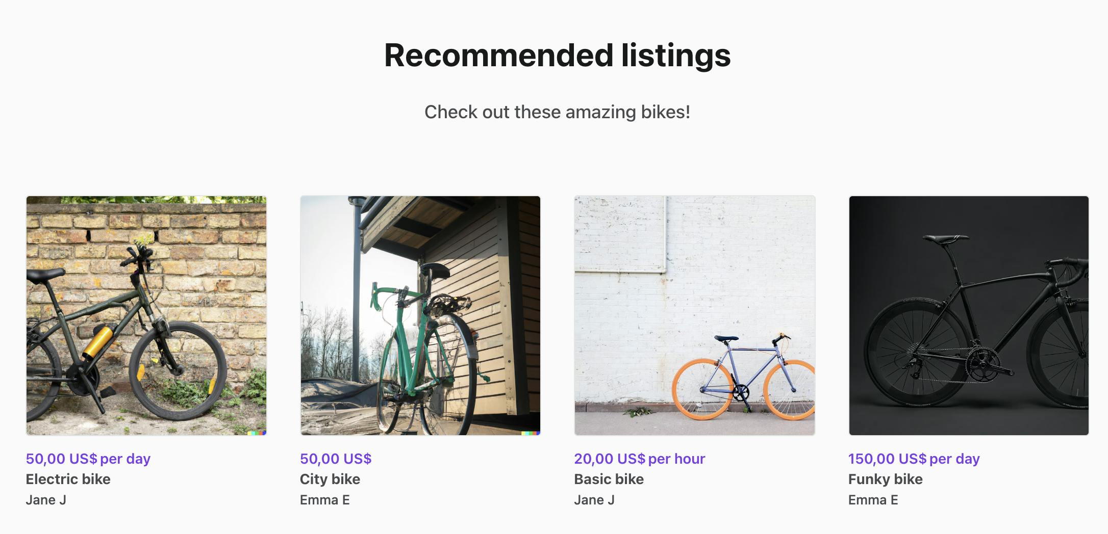
A common use case we get questions about is creating a recommended listings section on the landing page, so that the marketplace operator can add a showcase of listings and update them in Console without the need for code changes.
In this part of the guide, we will do the following:
* Create a SectionRecommendedListings component
* Create a ‘recommended-listings’ section in Console
* Get listing IDs from section data and set them to LandingPage state
* Fetch listings and add custom handling for section on LandingPage.js
### Create a SectionRecommendedListings component
The easiest way to create custom sections is to replicate an existing section. For _SectionRecommendedListings_, you can copy the whole _SectionColumns_ folder and rename it to _SectionRecommendedListings_. You would then rename the files, as well as replace all references to _SectionColumns_ with _SectionRecommendedListings_ within the files.
└── src
└── containers
└── PageBuilder
└── SectionBuilder
└── SectionRecommendedListings
├── index.js
├── SectionRecommendedListings.js
└── SectionRecommendedListings.module.css
You can see [an example of the SectionRecommendedListings.js file here](https://gist.github.com/SariSaar/3f27b834fe64e85be2e12f640aca91fb#file-sectionrecommendedlistings-js). The changes in SectionRecommendedListings.js compared to _SectionColumns.js_ are the following:
* Add the necessary imports for _useIntl_ and _ListingCard_
import { useIntl } from '../../../../util/reactIntl';
import { ListingCard } from '../../../../components';
* Add _listings_ to _props_ destructuring, and define _intl_
const SectionRecommendedListings = props => {
const {
...
listings,
} = props;
const intl = useIntl();
* Replace _hasBlocks_ check with a _hasListings_ check, and replace the _BlockBuilder_ component with a mapping of _listings_ into _ListingCard_ components
const hasListings = listings.length > 0;
return (
{listings.map(l => (
))}
) : null}
In essence, we want to modify this component to not render its blocks directly, but instead render the listings that have been fetched based on the block information.
The final step for adding this custom component is importing and exporting it in _SectionBuilderindex.js_. This will help us avoid circular imports.
└── src
└── containers
└── PageBuilder
└── SectionBuilder
└── index.js
...
// Section components
...
import SectionRecommendedListings from './SectionRecommendedListings';
...
export {
...
SectionRecommendedListings,
};
Next, let’s create the necessary section and block information in the Sharetribe Console!
### Create a ‘recommended-listings’ section in Console
Visit your marketplace Console > Build > Content > Pages > landing-page. Click the “Add a new section” link below the existing sections, and add the following configurations to the section:
* Section template: _Columns_
* Number of columns: _4_, although you can change this later
* Section title and Section description: add the content you want to show above the recommended listings
* Section call to action: _No call to action_ \- the listing cards are clickable, and will lead to the listing in question
* Section appearance: _Default appearance_
* Anchor link ID: _recommended-listings_ – this is the section id that we want to target in code.
* Content blocks: select four listings from your marketplace, and create four blocks in this section. For each block, add a listing UUID as the block name. Leave other settings as the default options.
Save your changes, and refresh your local marketplace. You should see a section with the title and description you added! However, no block information is rendered, because the blocks we added only have names and no content.
Now, we can get the listing ids from the section’s blocks and fetch their information from the API.
### Get listing IDs from section data and set them to state
The examples in this post both focus on the landing page, which has its own container, _LandingPage_.
Most content pages created with Pages are displayed with the [_CMSPage_ container](https://github.com/sharetribe/web-template/tree/main/src/containers/CMSPage). This means that to make similar changes in regular CMS pages, you will need to make corresponding changes in the _CMSPage.duck.js_ and _CMSPage.js_ files instead of _LandingPage.duck.js_ and _LandingPage.js_ files.
└── src
└── containers
└── LandingPage
└── LandingPage.duck.js
└── reducers.js
In this example, we are using the _SearchPage.duck_ _searchListings_ thunk to fetch listings and set them to SearchPage state. On LandingPage, we will dispatch the listing fetch function, map the listings to props from SearchPage state, and use them in the custom section. When a user navigates to the search page, the loadData function does a new fetch with the default search page configurations, so this does not affect the functionality of the search page itself. However, you could also build the listing fetching logic directly to LandingPage.duck.js.
Let’s start by defining and exporting the recommended listings section ID as a constant, so that we can use it both in this file and in LandingPage.js.
export const recommendedSectionId = 'recommended-listings';
Next, we want to add state capabilities to the LandingPage container – we will store the listing ids fetched from assets in state. This way, we can store the Console-based listing ids in state, and then use them to dispatch the _searchListings_ thunk with those ids.
// ================ Action types ================ //
export const FETCH_ASSETS_SUCCESS = 'app/LandingPage/FETCH_ASSETS_SUCCESS';
// ================ Reducer ================ //
const initialState = {
recommendedListingIds: [],
};
export default function reducer(state = initialState, action = {}) {
const { type, payload } = action;
switch (type) {
case FETCH_ASSETS_SUCCESS:
return {
...state,
recommendedListingIds: payload.ids,
};
default:
return state;
}
}
// ================ Action creators ================ //
export const fetchAssetsSuccess = ids => ({
type: FETCH_ASSETS_SUCCESS,
payload: { ids },
});
Then, we’ll create a helper function to get params for the listing fetch call. These params are similar to the ones used in _SearchPage.duck.js loadData_, and additionally we pass an array of _listingIds_ to the function to only return the listings specified in Console.
const getListingParams = (config, listingIds) => {
const {
aspectWidth = 1,
aspectHeight = 1,
variantPrefix = 'listing-card',
} = config.layout.listingImage;
const aspectRatio = aspectHeight / aspectWidth;
return {
ids: listingIds,
include: ['author', 'images'],
'fields.listing': [
'title',
'price',
'deleted',
'state',
'publicData.transactionProcessAlias',
],
'fields.user': ['profile.displayName', 'profile.abbreviatedName'],
'fields.image': [
'variants.scaled-small',
'variants.scaled-medium',
`variants.${variantPrefix}`,
`variants.${variantPrefix}-2x`,
],
...createImageVariantConfig(`${variantPrefix}`, 400, aspectRatio),
...createImageVariantConfig(`${variantPrefix}-2x`, 800, aspectRatio),
'limit.images': 1,
};
};
Now, we can update the _loadData_ function to parse the listing IDs from the page asset, and then save the ids in state.
Technically, you could also try dispatching the searchListings thunk in loadData as well, but that triggers errors for example when hosting your app in Render. By triggering the listing fetch in LandingPage.js, we avoid that issue.
export const loadData = (params, search) => dispatch => {
const pageAsset = { landingPage: `content/pages/${ASSET_NAME}.json` };
return dispatch(fetchPageAssets(pageAsset, true)).then(assetResp => {
// Get listing ids from custom recommended listings section
const customSection = assetResp.landingPage?.data?.sections.find(
s => s.sectionId === recommendedSectionId
);
if (customSection) {
const recommendedListingIds = customSection?.blocks.map(b => b.blockName);
dispatch(fetchAssetsSuccess(recommendedListingIds));
}
});
};
Finally, we need to connect the new LandingPage state in the application state. We do this by importing and exporting the new reducer in _src/containers/reducers.js_:
...
import LandingPage from './LandingPage/LandingPage.duck';
...
export {
...
LandingPage,
...
}
After this, we can start putting all this together in _LandingPage.js_!
### Fetch listings and add custom handling for section on LandingPage.js
In the actual LandingPage.js file, we need to do four main things:
* Map listings from state to props and add dispatch mapping
* Add a useEffect hook to fetch our listings
* Define custom page data, complete with the custom section
* Pass the custom page data and custom component to PageBuilder
└── src
└── containers
└── LandingPage
└── LandingPage.js
First, let’s add some imports and a new constant towards the top of the file.
import React, { useEffect } from 'react';
...
import { ASSET_NAME, getRecommendedListingParams, recommendedSectionId } from './LandingPage.duck';
import { getListingsById } from '../../ducks/marketplaceData.duck';
import { searchListings } from '../SearchPage/SearchPage.duck';
import { useConfiguration } from '../../context/configurationContext';
const PageBuilder = loadable(() =>
import(/* webpackChunkName: "PageBuilder" */ '../PageBuilder/PageBuilder')
);
import { SectionRecommendedListings} from '../PageBuilder/SectionBuilder';
const recommendedSectionType = 'recommended';
Toward the very bottom of the file, we have a _mapStateToProps_ function already defined. Let’s add _listings_ and _recommendedListingIds_ to that handling.
const mapStateToProps = state => {
const { pageAssetsData, inProgress, error } = state.hostedAssets || {};
// These are the ids from the Console section
const { recommendedListingIds } = state.LandingPage;
// These are the ids for the listings returned from the API –
// they may be different than the Console ones: if for example
// one of the listings was closed, it does not get returned from the API
const { currentPageResultIds } = state.SearchPage;
const listings = getListingsById(state, currentPageResultIds);
return { pageAssetsData, listings, inProgress, error, recommendedListingIds };
};
Then, we will need to add _mapDispatchToProps_ to the component as well, so that we can add a prop to fetch our listings.
const mapDispatchToProps = dispatch => ({
onFetchRecommendedListings: (params, config) => dispatch(searchListings(params, config)),
});
// Note: it is important that the withRouter HOC is **outside** the
// connect HOC, otherwise React Router won't rerender any Route
// components since connect implements a shouldComponentUpdate
// lifecycle hook.
//
// See: https://github.com/ReactTraining/react-router/issues/4671
const LandingPage = compose(
connect(
mapStateToProps,
mapDispatchToProps
)
)(LandingPageComponent);
Now, we can add our new props – _listings, recommendedListingIds,_ and _onFetchRecommendedListings –_ to the props destructuring in the beginning of the component:
const {
pageAssetsData,
listings,
inProgress,
error,
recommendedListingIds,
onFetchRecommendedListings,
} = props;
Next, we will add the useEffect hook that fetches listings once the ids have been fetched to state. Since the dispatch requires a _config_ parameter, we can use the _useConfiguration()_ hook that is built into the template by default.
const config = useConfiguration();
useEffect(() => {
const params = getRecommendedListingParams(config, recommendedListingIds);
onFetchRecommendedListings(params, config);
}, [recommendedListingIds]);
When this hook gets called, it triggers the listing fetch, and the fetched listings get then mapped to LandingPage props through the state mapping we did before.
For the next step, instead of passing the page asset data to _PageBuilder_ directly, we need to define custom page data that includes our custom section.
// Construct custom page data
const pageData = pageAssetsData?.[camelize(ASSET_NAME)]?.data;
// Find the correct custom section based on section id
const recommendedSectionIdx = pageData?.sections.findIndex(s => s.sectionId === recommendedSectionId);
const recommendedSection = pageData?.sections[recommendedSectionIdx];
// Define the necessary props for the custom section
const customRecommendedSection = {
...recommendedSection,
sectionId: recommendedSectionId,
sectionType: recommendedSectionType,
listings: listings,
};
// Replace the original section with the custom section object
// in custom page data
const customPageData = pageData
? {
...pageData,
sections: pageData.sections.map((s, idx) =>
idx === recommendedSectionIdx ? customRecommendedSection : s
),
}
: pageData;
Finally, let’s pass _customPageData_ and the custom component to _PageBuilder_.
return (
}
/>
);
Now, when you save the file, you can see your recommended listings section on the landing page!

You can test how the Console section settings work together with this section by
* Changing the listing ids in the block names or adding new blocks
* Changing the column count of the section
When you save your changes in Console and then refresh your site to fetch the new assets, you will see those changes reflected on your landing page.
## Hard-coded dynamic section: Current user welcome bar
---
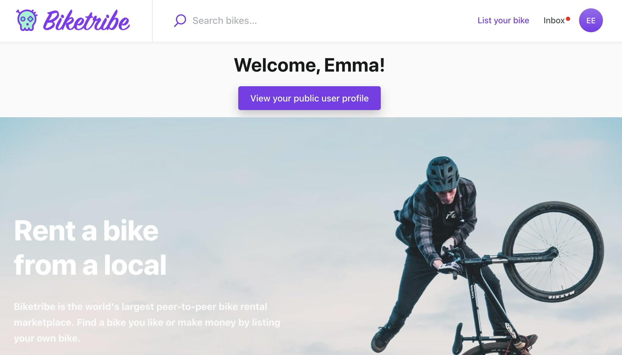
Sometimes, you may want to create a custom section that shows dynamic data that has been fetched from the Sharetribe APIs, but you don’t need to modify the section through Console in any way. An example would be a custom section that is only shown for signed-in users with the information fetched from the API.
Since we don’t need to involve the Console in this process, the steps for creating a hard-coded section are simpler:
* Create a SectionCurrentUser component
* Add custom handling for the section in the LandingPage component
Our use case is to show this section above the landing page hero component, and show a “Welcome {first name}!” title and a link to their public profile page. To do this, we need to use the current user’s details.
The simplest version of this would be to use the default _SectionArticle_ component, create the _title_ and _callToAction_ props in _LandingPage.js_, and pass them as props on to the custom section. However, we also want to visually modify this custom section, so we will create a fully new component.
### Create a SectionCurrentUser component
In the previous use case, we copied an existing section as the basis of our custom section. We can do that now, too. Duplicate the whole _SectionArticle_ folder, rename it and the files to _SectionCurrentUser_, and replace references to _SectionArticle_ with _SectionCurrentUser_ in the folder’s files.
└── src
└── containers
└── PageBuilder
└── SectionBuilder
└── SectionCurrentUser
├── index.js
├── SectionCurrentUser.js
└── SectionCurrentUser.module.css
In this example, we will simplify the _SectionCurrentUser.js_ component. You can see [a full version of the _SectionCurrentUser.js_ file here](https://gist.github.com/SariSaar/3f27b834fe64e85be2e12f640aca91fb#file-sectioncurrentuser-js).
The main changes we will make compared to our copied _SectionArticle.js_ starting point are the following:
* Add _currentUser_ to the props destructuring, and remove other props besides _defaultClasses_ and _options_. Return _null_ from the component if _currentUser_ is empty.
const SectionCurrentUser = props => {
const { defaultClasses, options, currentUser } = props;
if (!currentUser) {
return null;
}
* Define _title_ and _callToAction_ within the component using attributes from _currentUser_. To use Console-editable values for the _content_ strings, you can create new Marketplace text strings and add them to the relevant _src/translations/_ file and your Console's Marketplace texts editor. You'd need to import and use the _useIntl()_ function in the section similarly to _SectionRecommendedListings_, use the _intl.formatMessage(...)_ version for the texts, and add the key-value pairs to the necessary marketplace text files.
const title = {
fieldType: 'heading2',
content: `Welcome, ${currentUser.attributes.profile.firstName}!`,
// content: intl.formatMessage(
// { id: 'LandingPageSectionCurrentUser.title' },
// { firstName: currentUser.attributes.profile.firstName }
// ),
};
const callToAction = {
content: 'View your public user profile',
// content: intl.formatMessage({
// id: 'LandingPageSectionCurrentUser.callToAction',
// }),
fieldType: 'internalButtonLink',
href: `/u/${currentUser.id.uuid}`,
};
* Remove _description_ from _hasHeaderFields_ check
const hasHeaderFields = hasDataInFields([title, callToAction], fieldOptions);
* Replace _SectionContainer_ with a _div_ that has a custom class (we will define the custom class next). Remove the _Field_ row that renders _description_, as well as the whole _hasBlocks_ section.
return (
{hasHeaderFields ? (
) : null}
Next, you can add this custom CSS class to _SectionCurrentUser.module.css_.
.userContainer {
padding: 12px 0;
}
Finally, we can import and export this file in _SectionBuilder index.js._
└── src
└── containers
└── PageBuilder
└── SectionBuilder
└── index.js
...
// Section components
...
import SectionCurrentUser from './SectionCurrentUser;
...
export {
...
SectionCurrentUser,
};
Now the component is ready to be used on the landing page.
### Add custom handling for the section in the LandingPage component
On _LandingPage.js_, taking the new section to use has very similar steps to the previous use case:
* Map _currentUser_ from state to props
* Define custom page data, complete with the custom section
* Pass the custom page data and custom component to _PageBuilder_
└── src
└── containers
└── LandingPage
└── LandingPage.js
First, let’s import the new section and add a new constant for section type.
const PageBuilder = loadable(() =>
import(/* webpackChunkName: "PageBuilder" */ '../PageBuilder/PageBuilder')
);
import { SectionRecommendedListings, SectionCurrentUser } from '../PageBuilder/SectionBuilder';
const recommendedSectionType = 'recommended';
const userSectionType = 'user';
Then, we can add _currentUser_ to the _mapStateToProps_ function towards the bottom of the file.
const mapStateToProps = state => {
const { pageAssetsData, inProgress, error } = state.hostedAssets || {};
const { recommendedListingIds } = state.LandingPage;
const { currentPageResultIds } = state.SearchPage;
const { currentUser } = state.user;
const listings = getListingsById(state, currentPageResultIds);
return { pageAssetsData, listings, inProgress, error, currentUser, recommendedListingIds };
};
Now, we can add _currentUser_ to the _props_ destructuring in the beginning of the component:
export const LandingPageComponent = props => {
const {
pageAssetsData,
listings,
inProgress,
error,
currentUser,
recommendedListingIds,
onFetchRecommendedListings,
} = props;
Next, let’s create a props object for the new custom section, and add it to the beginning of the custom page data sections array. Since the section definition is getting more complex, we’ll also set our custom sections to a constant first for better readability.
const customCurrentUserSection = {
sectionType: userSectionType,
currentUser,
};
const customSections = pageData
? [
customCurrentUserSection,
...pageData?.sections?.map((s, idx) =>
idx === recommendedSectionIdx ? customRecommendedSection : s
),
]
: null;
const customPageData = pageData
? {
...pageData,
sections: customSections,
}
: pageData;
Finally, we can include the new custom component in the _options_ prop in _PageBuilder_.
return (
}
/>
Now you can test the component! When you are logged out, the landing page looks the same as it always does. When you log in, you will see a custom section on top of the Hero image!
Depending on what data you have saved in your user profiles, you can also modify this section to show
* Favorite listings, or a link to their favorite listings page ([see this tutorial for the favorites feature](https://www.sharetribe.com/docs/tutorial/add-favorite-bikes/))
* Top performing listings
* Review average
* Saved searches
…or something completely different!
## Summary
---
In this blog post, we reviewed two ways to add custom sections for your Pages content pages:
* We created a dynamic custom section for showing Console-defined data
* And we created a dynamic hard-coded custom section for showing user data
If you come up with other cool ideas on using custom sections, or if you have any questions, reach out to us at the Sharetribe Developer Advocate team through the chat widget in your Sharetribe marketplace Console!
## You might also like...
[Sharetribe's Postman collection](/developer-blog/sharetribe-postman-collection/)[Content Security Policy](/developer-blog/content-security-policy/)
## Liked this? Get email updates on new Sharetribe Developer Blog posts.
[Subscribe](#subscribe-dev-blog)