[Developer Blog](/developer-blog/)
# Adding items to cart
The first step of building a shopping cart is allowing our customers to add items to their cart. In this blog series, we are diving into the ins and outs of building a multi-vendor shopping cart with single-vendor checkout using the Sharetribe Developer Platform.
Mar 4, 2024

[](/author/sari-saariaho/)
Sari Saariaho
Developer Advocacy Guild Lead
**Note: The implementation in this article is built on top of [Sharetribe Web Template v4.1.0](https://github.com/sharetribe/web-template/releases/tag/v4.1.0), so if you are working on a later version, you may need to make some adjustments.**
The first step of building a shopping cart is allowing our customers to add items to their cart. Since only signed-in customers can start transactions on a Sharetribe marketplace, we can add the same limitation for the cart feature.
When a user is signed in to a marketplace, the application state contains a currentUser object representing the signed-in user. We will save the cart in the currentUser’s private data. We need to make the following changes:
* Add an “Add to cart button” to _OrderPanel_
* Pass the necessary props to _OrderPanel_ from the listing page components (_ListingPageCarousel_ and _ListingPageCoverPhoto_), or only one of them, depending on your layout
* Add a toggle cart function to _ListingPage.duck.js_ and map it to props on your listing page component
* Add the necessary functions on your listing page component as well as _ListingPage.shared.js_
You can find the code snippets used in this guide in [this Gist](https://gist.github.com/SariSaar/5bf9a1b5272976c82a080986f7617a0b).
The previous article introduced the [high-level view of building a shopping cart with Sharetribe Developer Platform](/developer-blog/shopping-cart-introduction/) – if you didn't already, read it first!
## Include an Add to Cart button in the project
---
The simplest iteration of an add to cart button would indeed be a __ component. However, let’s include some more functionality within the component, so we can use it in multiple ways in multiple places down the road.
This file contains an example of an [AddToCartButton component](https://gist.github.com/SariSaar/5bf9a1b5272976c82a080986f7617a0b#file-addtocartbutton-js). There are a few things to note.
Most importantly, we only want to show the button for products, not bookings. In addition, we only want to show it when the rest of the product form is also shown.
const AddToCartButton = props => {
const {
listing,
count,
incrementCart,
isListingPage,
buttonLabel,
cartLabel,
isBooking = false,
showProductOrderForm = true,
isOwnListing = false,
} = props;
if (isBooking || !showProductOrderForm) {
return null;
}
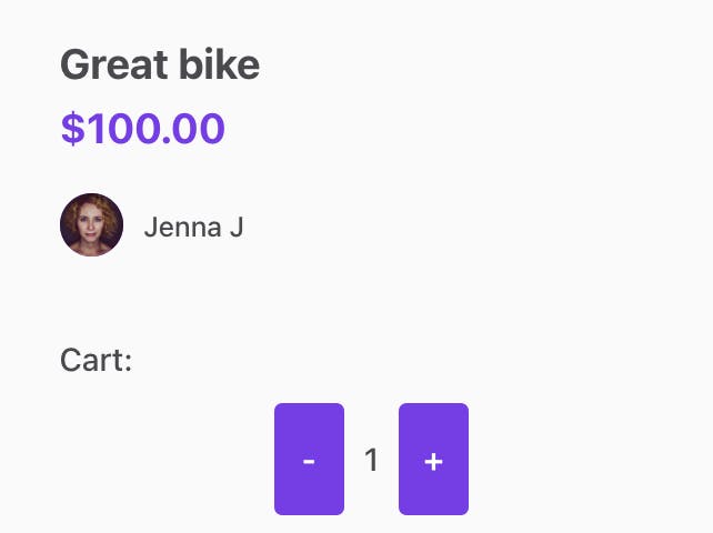
For products, we then want to show the button differently depending on whether it is already in the user’s cart, and whether the user can keep adding this item to their cart.
const increaseCount = () => incrementCart(1);
const decreaseCount = () => incrementCart(-1);
const currentStock = listing?.currentStock?.attributes.quantity;
const isMaxItems = currentStock <= count;
if (!count || (count === 0 && currentStock > 0)) {
return (
);
} else {
return (
{isListingPage && (cartLabel)}
{count}
);
}
};
To add the new _AddToCartButton_ component to your Sharetribe Web Template, you will need to do the following:
* Create a new folder _AddToCartButton_ in _src/components_
* Create _[AddToCartButton.js](https://gist.github.com/SariSaar/5bf9a1b5272976c82a080986f7617a0b#file-addtocartbutton-js)_ and _[AddToCartButton.module.css](https://gist.github.com/SariSaar/5bf9a1b5272976c82a080986f7617a0b#file-addtocartbutton-module-css)_ files in the folder
* Add an export for the file in _src/components/index.js_ – this way, you can import the button similarly to other components:
export { default as AddToCartButton } from './AddToCartButton/AddToCartButton'
## Add the new button to OrderPanel
---
Once you have made this new component available in your codebase, let’s add it to _OrderPanel.js_. Add _AddToCartButton_ to the list of imports from _../../components_, and include it in the return statement to replace _ProductOrderForm_:
...
) : showProductOrderForm ? (
}
cartLabel={}
{...cartProps}
/>
) : showInquiryForm ? (
...
Then, add a new prop, _cartProps_, to the destructuring statement at the start of the component:
const OrderPanel = props => {
const {
...
cartProps,
} = props;
Finally, add the [necessary marketplace text keys](https://gist.github.com/SariSaar/5bf9a1b5272976c82a080986f7617a0b#file-en-json) either to your template’s _en.json_ file or to the Marketplace texts editor in Console.
Now, if you visit the listing page of a product listing, you can see the basic version of the component:
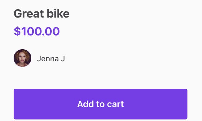
However, if you try to click the button, it will not do anything yet. Let’s add some functionality next.
## Add cart toggling functionality to ListingPage.duck.js
---
When a customer clicks “Add to cart”, we want to add the listing’s id in the customer’s private data. Since we are building a single vendor checkout logic, we also want to save the provider’s id, so that we know which listings were authored by which provider.
With these requirements, the cart information in the user’s private data could look like this:
cart: {
// First author ID
"6451caa1-00b2-41f4-b7aa-ef437f3b088b": {
// First listing id
"85168ae9-3560-485d-b618-3d446544035e": {
"count": 1
},
// Second listing id
"68b59b81-d6ee-4a83-8d43-442f220a7498": {
"count": 2
},
},
// Second author id
"d473d01b-2ad8-4cb1-9f05-f2dca397f2e5": {
// First listing id
"234f3325-a5e3-4a5e-8574-033c9e6b74a8": {
"count": 2
},
},
}
We could store this information in the application’s state, but it’s better to save it in the customer’s private data with an API call to persist the information properly. To do that, we need to create [a thunk](https://redux.js.org/usage/writing-logic-thunks) for calling the Sharetribe API.
At this point, we have two options:
* we can create the thunk in the _ListingPage.duck.js_ file
* or we can introduce a new .duck.js file called _CartPage.duck.js_
For now, let’s add a simple version of the thunk in _ListingPage.duck.js_ for the sake of focusing on this feature. Later in this series, as we introduce _CartPage_, we can then move the thunk to the _CartPage.duck.js_ file and expand its functionality.
You can add [these imports and functions](https://gist.github.com/SariSaar/5bf9a1b5272976c82a080986f7617a0b#file-listingpage-duck-js) to _src/containers/ListingPage/ListingPage.duck.js_.
The thunk does the following things:
* gets _currentUser_ from state, and gets the current cart from the user’s private data
* Updates the cart on the correct author, listing, and amount, adding listings and authors where necessary
* Calls the Sharetribe SDK _currentUser.updateProfile_ endpoint to set the updated cart to the user’s private data
* With the response from SDK, updates the _currentUser_ in state
Next, we need to connect the button to this thunk. We will make those changes on the listing page.
## Update ListingPage.shared.js and your listing page component
---
The Sharetribe Web Template has two different listing page components, corresponding to two different Console configurations:
* “Image carousel with thumbnails” layout option uses _ListingPageCarousel.js_
* “Screen-wide cover photo” layout option uses _ListingPageCoverPhoto.js_

In this guide, we will make the changes to _ListingPageCarousel.js_, but the same changes can be made to _ListingPageCoverPhoto.js_. In addition, we will make some changes to _ListingPage.shared.js_, which exports some common functionalities that are used on both listing page components.
### Add cart toggling function to listing page props
Let’s start by importing and using the _toggleCart_ function we created in _ListingPage.duck.js_ to _ListingPageCarousel.js_. First, add it to the import statement from _ListingPage.duck_.
import {
...,
toggleCart,
} from './ListingPage.duck';
Then, towards the very end of the file, we will need to add it to our existing _mapDispatchToProps_ definition. This allows us to define a prop for our listing page component that essentially dispatches the action we have defined for it.
const mapDispatchToProps = dispatch => ({
...,
onToggleCart: (listingId, authorId, increment) =>
dispatch(toggleCart(listingId, authorId, increment)),
});
Now that we have an _onToggleCart_ prop, we can add it to the destructuring statement at the start of the component:
export const ListingPageComponent = props => {
...
const {
...,
onToggleCart,
} = props;
This allows us to use _onToggleCart_ in the next step.
### Add a cart handling function to ListingPage.shared.js
On ListingPage.shared.js, we will add a [handleAddToCart function](https://gist.github.com/SariSaar/5bf9a1b5272976c82a080986f7617a0b#file-listingpage-shared-js). It basically does two things, depending on whether the user is signed in or not:
* If the user is not signed in, it redirects them to the login page, and then returns them back to the same listing page
* If the user is signed in, it calls _onToggleCart_ that we pass to it from _ListingPageCarousel.js._
The structure of this function reflects the structure of a lot of the other functions in _ListingPage.shared.js_ – it is a curried function. In other words, it takes its parameters one at a time instead of all at once.
export const handleAddToCart = parameters => value => {
...
This means that when we use the function on the listing component page, we can partially apply this _handleAddToCart_ function by only passing _parameters,_ and that way construct another function that we then pass on as a parameter to _AddToCartButton_. Let’s see how that works in practice.
Back on _ListingPageCarousel.js_, add _handleAddToCart_ to the import from _ListingPage.shared.js_, and then add [these functions](https://gist.github.com/SariSaar/5bf9a1b5272976c82a080986f7617a0b#file-listingpagecarousel-js-L23-L48) to the _ListingPageCarousel.js_ component.
We call _handleAddToCart_ with only one set of parameters, and the result is a function we will call _onAddToCart_. To create _onAddToCart_, we will pass all the parameters we already know we need, including
* the listing and author information
* the _onToggleCart_ function we connected to props earlier
* and some common parameters that are used in all the _ListingPage.shared.js_ functions.
We can then use the _onAddToCart_ function directly as the _incrementCart_ parameter that we pass to _AddToCartButton_.
const onAddToCart = handleAddToCart({
...commonParams,
location,
currentUser,
onToggleCart,
listingId: listingId.uuid,
authorId: currentAuthor.id.uuid,
});
...
const cartProps = {
listing: currentListing,
count: listingCartCount,
incrementCart: onAddToCart,
isListingPage: true,
isOwnListing,
};
As a final step, add a new prop _cartProps_ to _OrderPanel_ on the listing component page. Now, you should be able to add the listing to your user’s shopping cart!
# Summary
---
In this guide, we did the following things to add _AddToCartButton_ to a listing page:
* Add an “Add to cart button” to _OrderPanel_
* Pass the necessary props to OrderPanel from the listing page components (_ListingPageCarousel_ and _ListingPageCoverPhoto_), or only one of them depending on your layout
* Add a toggle cart function to _ListingPage.duck.js_ and map it to props on your listing page component
* Add the necessary functions on your listing page component as well as _ListingPage.shared.js_
In the next instalment of this blog series, we will take a look at [creating a cart page for viewing your shopping cart selections](/developer-blog/viewing-cart-items/)!
Photo by [David Veksler](https://unsplash.com/@davidveksler) in [Unsplash](https://unsplash.com/photos/toddle-carrying-red-and-white-box-standing-beside-yellow-shopping-cart-2zl0b3NbSjU)
## You might also like...
[Building a shopping cart for a Sharetribe marketplace](/developer-blog/shopping-cart-introduction/)[Viewing cart items](/developer-blog/viewing-cart-items/)[Calculating shopping cart price](/developer-blog/calculating-shopping-cart-price/)
## Liked this? Get email updates on new Sharetribe Developer Blog posts.
[Subscribe](#subscribe-dev-blog)